

(PSN)Maunstre
-
Posts
177 -
Joined
-
Last visited
Posts posted by (PSN)Maunstre
-
-
@[DE]Danielle With the build still in-dev, is there a possibility that PC hotfixes 6.6 and 6.7+ might also be picked up and included for consoles, or have aspects cherry-picked like in previous mainline updates?
-
 1
1
-
-
59 minutes ago, [DE]Danielle said:
Correct, they will be coming in the next hotfix 🙂
Thank you! In a future hotfix, can we have the Scintillant appear in the loot radar like PoE Wisps? It is extremely difficult to find and see inside the vault.
ETA2: also, can the team please look into issues with collecting the Scintillant? When I finally encountered one (solo), no matter what I did, I could not pick up the scintillant. I meleed, I shot at it, I void-dashed at it, shot my amp. Nothing worked. Very frustrating!
-
6
-
-
2 hours ago, [DE]Danielle said:
-
Updated the Cambion Drift Isolation Vault Bounty description to hint at clearing multiple Vaults in the same session for better rewards. -
Moved 2 Scintillant spawn points within the Isolation Vaults to be in more trafficked areas.
Hi, Danielle - these crossed-out fixes, just to clarify - does this mean we don't have these fixes currently?
-
-
If you have access to the node, try farming on Kelpie, Sedna! Disruption on Sedna and the Kuva Fortress have a chance to run the "Pack Hunter" conduit effect, which are guaranteed to spawn Grineer Manics. If you have solid gear, you can blast through several rounds of Disruption and get multiple chances at Ash's drop. You'll just need to be extra aware of where the Manic is, since there will be Grineer everywhere.
11 minutes ago, mhdguy said:ash parts drop from grineer manics you will not find any grineer manics in an infested mission
Yursa is a Defection mission, Manics are sent in by Sargas to attack the Kavor Defectors after a few rounds.
-
Warframe is full of people who play solo! I don't know if there is a traditional "community" pre-se of them, but they're all over and regularly frequent the forums and chat rooms. I've been playing solo since I joined a little over two and half years ago. I sometimes play with friends, but when it comes to any and all new content, I solo it first without exception before squadding up with friends. I play Railjack solo and I keep a solo clan.
While there isn't a dedicated community of solo players, most players will know how to solo something, so you can always ask for tips or advice. Everything in Warframe can be done solo; some things are genuinely easier by yourself than in a group, others are markedly more difficult. The only real difference is that in some cases you have to be more cognizant of your choice of loadout, but 9/10 what you bring doesn't matter too much for so long as you know how to use what you have. Playing solo will definitely tell you how powerful or well-familiarised you truly are with your gear and the game.
Playing solo does have one big perk, and that is the ability to actually pause the game (with some exceptions; any game mode or part of the game that requires constant real-time updates cannot be paused, like PoE, Orb Vallis, and Scarlet Spear).
In terms of "how to start playing solo", pretty much all you need to do is set yourself to "solo" and pick a node! If you're still finding your footing overall with the game or are early in the star chart, doing some earlier nodes on Venus or Mars is a good idea. If you can handle some early exterminates solo, or can solo Jackal or Vor, or can capture a Capture target solo with your preferred gear, I think you're more than set to keep soloing.
-
1
-
-
Fantastic thread, thank you for taking the time to make it!
I haven't had a chance to watch the full interview myself, but one thing I hope might be addressed sometime is: the ease of acquiring Lua Lenses versus Eidolon Lenses. Eidolon Lenses are a tier below Lua Lenses and required to build Lua Lenses, but Eidolon Lenses are harder to attain than Lua Lenses by a fair margin (in personal experience). Time-wise, you have to invest far more effort into an attempt at gaining an Eidolon Lens, which is a reward from T5 PoE Bounty only, 4% and 7% drop chance in stage 4 and 5 respectively with a guaranteed time-sink due to Bounty completion time being hamstrung by arbitrary timers and travel; versus the Lua Lens, which you can just roll almost eternally for thanks to the repeating Rot C rewards inherent to the Disruption reward mechanic. Despite attempts, I have more Lua Lens BPs than I ever have Eidolon Lens BPs. The barrier to gaining Eidolon Lenses is a lot higher than Lua Lenses.
Eidolon Lenses have another issue associated with their acquiring: being fused to the Bounty system. Bounties don't have particularly engaging rewards outside of vaulted relics. The drop pool for Bounties is very diluted with material that is stuff you can pick up off of the ground on the Plains, or things you build only once (Gara, Revenant, etc). On the inverse, Lua Lenses come from Disruption, a game mode that always has something valuable in its drop-table. Even if you aren't farming for the Lua Lens specifically, you can get it while passively farming for something else that has high player value. The Eidolon Lens doesn't have that sort of "passive" or "high value" earning path. You have to play a time-consuming, largely unrewarding bounty for a chance at an Eidolon Lens.
I know we can buy Eidolon Lenses in the market now, but it would be nice if we could farm them more effectively. Why not have them drop off of Eidolons as their own reward, separate from Arcanes, like the Articulae are? They share the name and would be thematically appropriate.
-
2
-
-
An attitude like this is the reason we're still stuck with terrible grindfest crafting costs like Sibear and Hema. In essence you're saying "I suffered doing this so you have to suffer, too!" It's like complaining that you bought something when it was new and premium, but someone else bought it later when it was in the bargain bin and saved money. That person taking advantage of a bargain does not effect you in any way, but you're still upset.
Serious question - why should a method of attaining something, like Arcanes, never be allowed to be improved upon or otherwise made less of a chore, even for only a short while, just because someone in the past did it the "hard" or "intended" way? Warframe is constantly changing, constantly changing to improve itself, better suit its playerbase's needs, or even to just surprise them for a bit. This is what keeps it alive. Would you rather the game instead just wasted your time with an exponential grind that never improved?
Speaking to Arcanes specifically - this event gave us a means to farm Arcanes easier than just running Eidolons because Arcanes just received a massive rework, now requiring even more to reach max rank and players being unable to "double up" on them anymore for maximum effect. Honestly, this pays respect to the time invested by those who put in the grind to get the Arcanes originally, because their original system has just been completely upended. Instead of just telling everyone to go back to grinding Eidolons, everyone is being given a chance to quickly get their existing gear up to where it was before with minimal hassle before the previous methods are restored.
If Warframe remained static, without reworks or revisions or special events, it would die off. If you're legitimately upset that the game changes and evolves over time to better itself, then a game in perpetual-Beta may not be something that's for you.
-
13
-
-
I've done a number of Murex Raids solo, and have noticed a very strange trend in random mission failures involving pressing the R1 button.
I am unsure what causes this failure exactly, but from multiple failures I've gleaned that holding down the R1 button for more than a few seconds before pressing an associated ability button (square, triangle, ex, circle, or L1) may be a potential trigger. I have had this happen most often when holding down R1 for a few seconds and then pressing L1 for Transference. The mission immediately ends with a Mission: Success, or Mission: Failure overlay with Little Duck transmitting that I am out of OpLinks.
This mission crash seems to be most likely to occur before the deployment of the Oplink in the first Murex. Even though an OpLink has not been deployed, if this failure happens LD gives me a transmission that the OpLink has been destroyed.
This crash has not happened to me during squad play in a Murex Raid, only while solo, and has not happened during a Condrix Raid solo or in squad as of yet.
-
I'm an unapologetic Limbo fan and had an idea for a skin that I felt would be appropriate to share here - "Limbo Geryon", a reinterpretation of the concept of the frame and its ability to "walk between worlds":
General rough:

Second rough:
The underlying themes are "death and transportation" - ravens, coach / chariot driving, and the mythic entity Geryon of Dante's Divine Comedy.
Ravens are associated with death or heralding the death of a hero. Coaches and chariots are an aged means to transport people from place-to-place. Geryon is a chimeric figure with the body of a wyvern, claws of a lion, stinger of a scorpion, and the face of an "honest" man, who ferries Dante and Virgil from the ring of Violence to Fraud.
I used these themes because they felt... appropriate for Limbo for a few reasons, one major reason being that most players absolutely hate this Warframe, either because they don't know how to use him, don't know he's been reworked, or have run into bad or trollish Limbo users. Regardless of the reason, Limbo is not very popular, making him something of a pariah in the average arsenal. Second, Limbo can "take" or "send" players places they would really rather not go (ie: the Rift), and any enemies sent into the Rift are generally forced there to die at the will of the Limbo player. Third, Limbo is part magician, and magicians are illusionists - able to fool a viewer with tricks and glamour. To some people this is fraudulent activity since, after all, "magic doesn't exist".
The skin itself would sport iridescence along the exterior of the coat tails, similar to but not as bright as that of a magpie, with some iridescence along the sleeves above the cuffs. Metals would be dulled, but not weathered. Emissives would glow brightly and trail energy while Limbo is in the Rift, the head and chest especially, both to give an otherworldly flare, and as a secondary indicator that the user is in the Rift (something I continue to have problems with being able to tell despite being an avid Limbo user).
I originally shared this concept on my Twitter, hence the Twitter watermark. The original Tweet is here:
This was about a day-and-a-half's work or so. It doesn't really "change" Limbo's overall design all that much, mostly because I find Limbo's base design to be very aesthetically attractive on its own. While it will never be "finished" as a skin specifically, I hope it's an entertaining idea.
-
1
-
-
1 hour ago, Azamagon said:
Hey OP?
Seems like another thing you mentioned for improvement (the "About" section) was added:
I'd say it's not unlikely a nice chunk of the reason why it's getting implemented is because of this excellent thread of yours! 🙂
Thank you! I'd say so, too! I'm incredibly glad that it looks like this thread may have left a real impression - I'm extremely happy to see these changes!
-
2
-
-
@[DE]Rebecca I just finished watching today's Dev Stream, and saw the coming changes to the Parazon screen! May I ask, was this change already in development, or was this change potentially inspired by this thread? Even if it is not, I am extremely excited as a player to see this change rattling in the pipes. Thank you very much!
-
Whoa, this is so cool! I really dig the "show diorama" idea, I think it would be a great way to appease both sides of the aisle.
A few points (pardon me if these have been mentioned already):
1. Your Tips section is going to NEED a tab / alternate navigation option, like L1 / R1, because there is 0 way a controller cursor is going to be able to hit those tiny points, potentially some mice, too, if a user's hand is unsteady or they're just moving too quickly or the mouse is bad. Even with what we have right now, like in the Arsenal for colours, half the time I wind up picking the wrong box for the dual-energy colours because the boxes are so damn small. I am 100% certain I wouldn't even bother with that section if the Tip pips could only be operated by click and I had to hover on those tiny shapes. I'd be complaining in the Forums about it in a heartbeat.
2. I would make the ability cards a little more opaque, too. Transparency is fun, but if the colours are bright or strong enough, it will bleed through the card and make the text very difficult to read. In particular you can see it in this screen shot, there is a big difference between the readability of Spectral Scream versus Effigy. You can see / feel the red of Effigy's energy cost vibrate against the background colours. I would bump up the opacity for sure to keep the viewing plane more constant:

2a. Watch your midtones. I mentioned this in my own feedback thread. A massive problem with transparency is the clashing of midtones to make things extremely difficult to read. Your abilities screen, while very enamouring to look at, is going to be a disaster zone of midtones if the diorama has bright or very strongly coloured lights. To prove my point, this is the same screen, but desaturated:

You can see the readability progressively get worse from Ability 1 to Ability 4 due to the lighting in the background. Don't invest too heavily into pretty transparencies, it's a massive design trap. You've got the "Show Diorama" button, let that do the job of showing off the "NEAT!" background for you, don't let the background spoil your accessibility.
3. Where would you put Focus gain for your End-Of-Mission screen? The lack of space for Focus was a big bone of contention in the main thread last I took a peek.
4. This would require testing, but text size for the ability screen might need to be bumped up by a size or two to accommodate those who play while sitting away from their screen - like us console / television plebs. The distance might make some of the text difficult to read, in particular my mind goes to the Passive and Tips bar on this point, the text feels incredibly small.
5. Don't be afraid to use bold text! Crisp text looks more "refined" and "delicate", appropriate for sci-fi, but bold can be a whole lot more accessible even if it feels more cave-man aesthetically. Sometimes the pixel size and kerning on crisp text is... well, total pants and it can make your delicate text look like a soup of lines and, if it's especially bad, make some of the characters seem to bleed into one another or just seem to disappear. This is most evident in characters like "i". Bold helps to mitigate this in some ways. If the text is only 1 pixel wide, that's probably not a good sign for the readability of your screen. If you take a look, you'll see that a lot of Warframe's current UI text is in bold or a very close relation called "Strong". The two are alike but not the same.
-
4 minutes ago, (XB1)OdinAsteroid said:
You know what's going to happen? Nothing. And you know why? Because DE employees have proven they're not capable of understanding what needs to be changed or done to improve the game, even if it's "only" the game's UI. Yes, they might implement some of the player proposed changes, yes they might "improve" flawed exisiting mechanics, but all that doesn't cover the fact that DE at one point thought these are good designs, ideas or mechanics.
It's as if you're giving a man one fish (or 10 or 100 doesn't matter) and expect him to be able to self-sustain for the rest of his life. Spolier: he won't be able to self-sustain until he learns how to fish!
As much as this is a very real possibility, I want to be hopeful. While making this thread I had in mind the many times the community has been ignored in similar circumstances, in some cases for years for things like Vacuum for pets, or still ignored for things like non-scaling excavators, and I seriously considered whether the effort I was putting forth (three days of work, as mentioned above) was actually worth it. However, even with these thoughts in mind I did it anyways, because I want to think that DE might change. For all I know, like the problems with getting Vacuum for pets implemented, I'm preaching to a choir that agrees but can do nothing because there is someone above them who says "no" for reasons unknown and opposed to a streamlined player experience. There's also the possibility that this isn't the case, that no one agrees and I was just given lip service by a member of the dev team to make me feel better for the effort I put into this thread. I don't know, but want to assume the best. I want to assume that DE just needs a nudge in a different direction.
To be extremely frank I think DE needs to change at this point - they don't have a choice, even if they think they do. If they don't, I think rough times are ahead for them, because as I mentioned in the OP, their players are not stupid. I am not stupid. My friends who play this game with me and who are the biggest reason I got invested are not stupid. When we group up together our conversations have changed from the things we enjoy about the game to the things that desperately need fixing but are being ignored. Logging in to see these same problems persist for months, years on end has affected our enjoyment, coming to an immense head with the Old Blood and the evidently rushed and not-ready-at-all launch of Empyrean. Railjack wasn't ready when we last saw it on Devstream before its launch on PC, and I wasn't excited when I saw the redtext pop up for console. Personally, I find it hard to log in just for daily tribute, because it is difficult to engage with something that is being twisted to make the process of having fun a whole lot more difficult than it needs to be.
The player metrics that have been being shared in the community of late paint a picture that clearly suggests that what DE is doing is not working, and the player drop-off rate suggests that players new and old aren't afraid to just let the game go at this stage. The veneer of "the little game that could" only lasts for so long. Warframe is a multi-million-dollar machine and DE is a studio of over 300 people last I heard. DE doesn't exist in a bubble, and their players don't exist in a bubble, either. Warframe may be the only GaaS title I play, but that doesn't mean I don't keep my ear to the ground on what is happening elsewhere in the industry, especially in regards to GaaS. I keep a comparison going in my head of what these other companies are doing that has tanked their products that DE keeps edging towards. I love Warframe, but I'll dump it if I must. Sure, I've invested time and money into it, but trust and goodwill is finite. Bethesda learned that the hard way in 2018 with F76, they lost everything they had built up for years in less than 4 months, and they aren't the only ones. TC's GR Breakpoint forced Ubisoft to remap their earnings for an entire year and cancel projects due to how badly it was received. Players. Aren't. Stupid. They can tolerate garbage for a surprisingly long time, yes, but every camel has a limit, and DE needs to take better care of its herd. Camels talk amongst each other, after all.
-
2
-
-
10 minutes ago, (PS4)LeBlingKing said:
I love it, but everything I want to say about it specifically has already been said.
All I have to say is, if DE implements even half of the changes you've shared with us, you should be compensated accordingly.
Thank you!
Well... I am a freelancer! I'd certainly be happy to keep making work like this if DE might have any further use for feedback and ideas like mine.
-
4 hours ago, ciTiger said:
Thanks ❤️
You're most welcome, thank you for the kind words! I sincerely hope some of these suggestions will be taken onboard!
4 hours ago, ciTiger said:For those who haven't seen it yet, here is a video of a Warframe partner showing the woes of the UI and how a simple changes would make a world of difference:
Woo I hadn't seen this video! Good to see there's some shared wavelength going on! It's nice to know I wasn't alone on my thoughts of the Lich mod system (I admit my friends and I have our own unflattering names for the mods since we can't put the names to the symbols ourselves and just don't enjoy the process of Lich hunting overall).
-
1 hour ago, DragoonStorm1 said:
IN FACT, as an MR 28 player who missed out on the first two weeks of railjack, I actually LEARNT things about the avionics screen (which I've been avoiding like the plague) from your redesign.
Wow! Thank you very much, I am incredibly happy it helped! The Railjack Avionics UI has been a massive point of personal contention since Empyrean launched, I had to read the forum post twice to get a handle on how the heck it was supposed to work and it was a massive driver to making this thread.
-
4
-
-
5 minutes ago, DreisterDino said:
@(PS4)Maunstreappreciate the work you have put into this, this probably took a few hours to write..
While you focus on the Ui which is not directly connected to In-Mission-Gameplay, the feedback i posted was focussed on that part.
Ill just leave it in the Spoiler below since the Ingame Part is just as important imo:
Thanks! Three days total with all the writing, capture, paint overs, and proofing involved by the end. In document form this thread is 23 pages long, the forum aspect makes it seem a lot less intense than it was to create. The fact that it wound up taking so long is part of why it sticks only to UI.
You are definitely right on your points on gameplay. The Lotus taking up a massive swathe of the screen during the Ropalolyst fight has been a personal bugbear ever since I ran that fight a second time. You legitimately cannot see properly through the hologram when moving at speed, you may as well just have half of your television just disappear.
-
5
-
-
2 minutes ago, Hawk_of_the_Reborn said:
For the love of god get rid of that red UI. I literally can't see anything your screenshots had, it hurts my eyes
All the more reason I said this:
13 hours ago, (PS4)Maunstre said:The proper balancing of colours should be at the forefront of the mind of a UI designer if the ability to swap colours for aesthetics is an option, especially if that option is locked behind a paywall. Ultimately, what is given is irresponsible design, especially when players are asked to pay Premium - real money - for these themes. This makes me incredibly reluctant to purchase any of the remaining UI themes as a player.
-
4
-
-
5 minutes ago, [DE]Rebecca said:
Awesome thread, thank you for putting this much feedback together!
Thank you very much for taking the time to read it, Rebecca!
-
10
-
-
This post is feedback on the UI of Warframe, specifically where it sits right now, what it accomplishes and what it doesn't, and where it could improve. This post was inspired by [DE]Pablo's forum thread on the UI workshop here:
I already left some feedback on this thread, which can be seen here (somewhat spicy, pardon me):
This thread is an expansion on some of the feedback made there, boosted with screen caps, mock ups, and comparisons. Critique will be focused on various UI screens currently implemented. In particular, the Market, Codex, inventory, Lich and Requiem Mods, and Railjack Avionics UI will be critiqued. It is a long thread, but it will not be hidden under cuts, because I want it to be seen in full. This thread is an approximate 35 minute read.
This thread is broken into sections, which are as follows for CTRL + F use:
Preface - Who is Making This Critique and Why
General Critique - A "Clean" UI Does Not Mean an "Informative" UI
Market Critique - A Market Should Inform The Buyer
Codex Critique - Unnecessary Nesting and Hiding of Information
Inventory Critique - "90% of What is Available" Does Not Equal "90% of What is Used"
Lich and Requiem Critique - Unnecessary Segregation Defeats Accessibility & Enforces Content Islands
Railjack Avionics Critique - "Overwhelming" Does Not Necessarily Mean "Too Much Information"
Conclusion - A Sincere Ask For Reconsideration
Preface - Who is Making This Critique and Why
Hi, DE, I am an artist, lover of video games, and 2+ year player of Warframe. I have made this thread because as a player my experience has been greatly impacted by the recent changes to the game’s User Interface - primarily to the negative. Vital information that was previously easy to access has become hidden and difficult to find. I understand and recognise Warframe’s identity as an information and numbers-driven game, but have noticed that recent changes to the UI have tried to mask or outright deny this fact for reasons unknown or simply alien or inappropriate when held in contrast the game’s base nature of complexity and reliance on statistics and comparisons. As a person trained and invested in the visual arts, I understand the draw of aesthetically pleasing design as a potential driver for these changes. However, form and function are attributes that need to be balanced according to purpose, and I distinctly feel that Warframe’s current UI and the further direction it seems to be heading is in direct opposition to what its purpose should be - sacrificing function for form in an unnecessary way when function should be its paramount focus. In this thread I will be explaining why I feel this way and how I believe it can be rectified without sacrificing either the assumed form desired by the UI designer, or the information and functionality needed by the player. Examples given here are not exhaustive, but I hope will prove both useful and a concrete argument for a change in direction.
General Critique - A "Clean" UI Does Not Mean an "Informative" UI
Warframe’s current UI is evidently gunning for a minimalist approach - similar to that of mobile games and larger titles like Breath of the Wild. The desire for this direction is understandable - Warframe has a lot of content, each piece of which is part of a larger whole which in turn feeds into an even larger system. Streamlining the sorting and fetching of these small parts is integral to its survival as the number of these pieces grows. However, "Minimalism" does not mean "stripped". The spirit of minimalism is the removal of excess - to the make vital information easily accessible and organised. The current UI misses the point of this in a roundabout way - removing the vital (information) while emphasising unneeded excess (roll-overs, oversized buttons, gradients, and uninformative detailing).
For example, a dressed-down Minimalistic approach works for Breath of the Wild because Breath of the Wild is fundamentally and functionally not as complex as Warframe - there are fewer moving parts, stats, or screens, and any information it needs to communicate to the player is kept concise by design, its systems visually streamlined to needing little more than a quick description or a very pointed infograph. For example, this screen of Link about cook a meal:
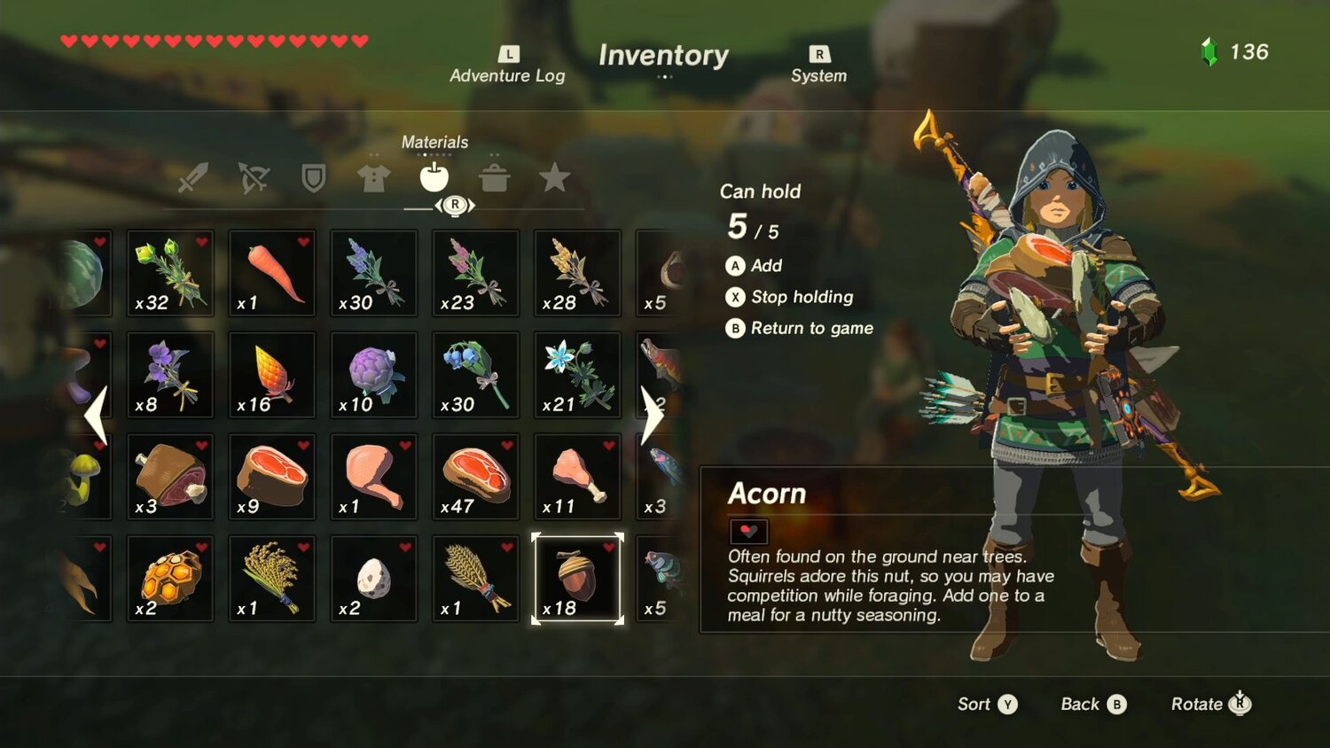
The item highlighted is an acorn. From the get-go, we know what an acorn does all by itself - this is a consumable that gives back health. We know it gives back health because it has a tiny heart in the corner of its icon and Link’s health is represented above by a series of hearts. We don’t need to select or hover over the item for that information unless we want the finer specifics. In a similar vein, we also have an immediate connection between the icon of the acorn - in item in this specific circumstance that is found in the fantasy world of Hyrule - and the real world. We have acorns in real life, and an understanding of what an acorn is as an object is practically innate because we are taught to associate an acorn with food, and food is associated with keeping a person active and healthy. Hence, it makes sense that an acorn is a healing item that bestows its healing attribute by “eating” it.
In comparison, this is Warframe’s Gear inventory page, minus labels:
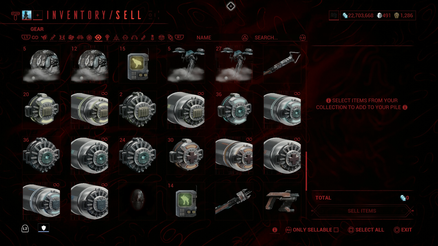
This is presented exactly like the UI of Breath of the Wild, but gives the player none of the same information; it’s clean but sterile. I know how much of a thing I have, but if I were a new player or had left the game for quite some time, I wouldn’t know what any of one thing was or what it did at a glance with exception to the Health Restore. The Health Restore item communicates itself readily and easily, primarily because it utilises a universal symbol for medical aid, the red cross. The other Restore items share the shape and design of the Health Restore, but their identifying icons don’t immediately mean anything. We can assume by shape-association that they act the same way as the Health Restore, but outside of that what they actually “restore” is not intuitive. The Shield Restore uses a “shield” icon for its identification, but in terms of symbolic association, we associate the universal “shield” for “armour” like what is used by a knight - protection. There is word association in-game - a shield symbol for Warframe or ally shields, but to the uninitiated this may not be clear, instead potentially suggesting that the Shield Restore instead affects or “restores” armour, a static value that cannot be changed during gameplay except in special circumstances. The remaining items in this screen have no root in any universal or real-world symbolism, making them a mystery.
As a second comparison, this is Breath of the Wild’s weapon inventory screen:
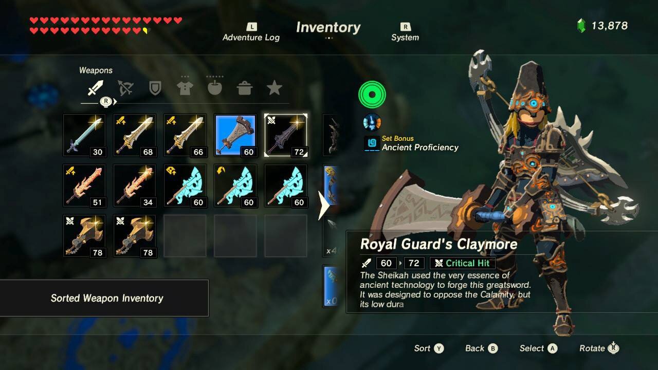
Very clean and very informative even without labels. Much like the food inventory screen before it, the icons are descriptive and have immediate real-world association. Most people recognise what a sword, a club, or an axe is. In this screen, Link is wielding a two-handed sword-like weapon called “Boulder Breaker” (hover stats for the Royal Guard’s Claymore are being shown in the screen cap instead of those of the sword actually equipped). The name of this weapon wouldn’t mean much to the average person, but its design is reminiscent of a sword - it has a double bladed edge and looks like a sword overall. Even though the average person probably doesn’t know the difference between a one-handed and two-handed sword and how that affects one ability to attack and enemy, the game tells us this information readily by showing us Link’s physical stance while holding the sword. “Boulder Breaker” is specifically a heavy-type weapon, a distinction shown to the player immediately upon selection by Link’s stance changing from unencumbered to weighed down - telling us that this weapon is “heavy”, that it will be powerful but will swing slowly! Also immediately available to us as a user is weapon strength, told to us by way of tiny numbers in the bottom right corner of the icon. We don’t need to select the weapon or hover over it to see how powerful it is, it’s right there and the player can do an immediate visual comparison between what they have equipped, shown pointedly in blue, and what else they have in their inventory - all at a glance.
Contrast this with, Warframe’s weapon inventory screen without labels:
Again, presented like the weapons inventory screen of Breath of the Wild. This comparison could be considered unfair since the Arsenal exists, but the Arsenal is not the go-to way for a player to check their inventory for an item, the inventory menu is.
Because I am a two year+ player of Warframe who specifically pursued every weapon I could reasonably obtain, I recognise what each of these weapons are and what type. However, I have experience on my side. The average person or new player who looks at this screen wouldn’t be able to tell any of these apart. In this screen alone there are polearm, staff, shotgun, tonfa, pistol, rifle, sword, pocket-shotgun, sniper rifle, mace, throwing, scythe, dagger, glaive, and bow weapons, several of which that on even a close look could be considered interchangeable in class or type by visual design alone. We have no way of discerning the difference between these weapons without names or labels, and with the fantastical naming conventions of Warframe taken into account, the base names of several of these weapons would mean little to nothing to the average person. Also, the in-game utility of these weapons is utterly unknown at a glance. Which one is stronger of this set of 24? Faster? Bigger? Smaller? Trigger? Auto? We don’t know. In terms of Warframe’s specific needs and terminology, which of these weapons would count as a Primary versus Secondary? Melee versus a very sword-like gun? Some of these pistols look like they could be rifles. What about weapon Rank, a considerable defining factor in whether a weapon is kept or sold, depending on the type of player? Completely absent.
To compound all of this, if any of these items are selected in this screen, we don’t get a preview or list of stats, we merely add it to a list to be sold. If we want to actually see the information regarding any of these items, we must specifically hover over the icon and tab, if applicable, to see its full information. Further, with this system we cannot compare stats on the fly, to compare weapons we must be in the Arsenal with at least one weapon already equipped to see a one-to-one stat change.
Warframe’s UI is clean, but sterile of information, especially with labels disabled. This makes an information-dense game all the more impenetrable. This could be forgiven in very specific instances, but where this practice is especially egregious is where information should be front-and-centre, the Market and the Codex.
Market Critique - A Market Should Inform The Buyer
Counter to their purpose to dispense information, the Market and Codex UIs are surprisingly uninformative. In the Market, while the featured Warframe or weapon is given ample space to look attractive, the information for that Warframe or weapon - its stats, features and associated perks, the reason to buy that item - is missing. Example: Market pages for the Frost Warframe and the Latron weapon:
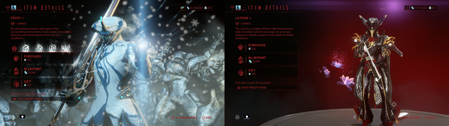
No actual information is being shown here at a glance. The first thing we see is “BUY”, “BUY”, and “also gift I guess”. To a certain degree the prominence of a “BUY” button could be considered “fair” since Warframe is a free-to-play game that survives on in-game purchases. However, it doesn’t excuse the complete absence of basic information that is supposed to entice the player to buy the items presented. A diorama is nice, but gives no information outside of what the product looks like. This hiding of basic information, especially for weapons, gives no reason for a player to buy the item - why buy it when you can’t tell what the item does or whether it’s any better than what you currently have? Shockingly, we don’t even have the “ABOUT” button to give us information here, the one location it could be considered appropriate.
Suggested changes:
The Market’s biggest issue is the absurd size of its “BUY” buttons, of which there are three - one for flat personal purchase with platinum, the blueprint for us craft-happy hard-casuals, and a gift option. “PURCHASE” and “GIFT” by themselves take up considerable screen real-estate that could be dialled back considerably by placing the two directly together to free up half of their allotted space. Further nudging the full suite of buttons to sit lower on the screen provides space enough to fit a small stats window - the information a discerning buyer would likely want to see before making a purchase - without suffocating the screen.
As Warframe is a numbers-dependant game, and even the greenest of player will gravitate to numbers and glean some knowledge from them regardless of familiarity, the fact that such basic item information is missing or hidden from view in the very place it would be most influential to encourage a purchase is confusing. Where is this information if not in the Market? It’s viewable elsewhere, where the Market isn’t - the Arsenal and the Codex.
Codex Critique - Unnecessary Nesting and Hiding of Information
Much like the Market, the Codex suffers from a curious lack of information when information is the purpose of the Codex. While the Market could defend its design with an argument for the importance of an assortment of “BUY” buttons to drive purchases, the Codex has no such excuse. However, regardless of this the Codex hides its information by way of nesting via this community-reviled rollover button:
That this space-occupying, functionally bankrupt button has become a community meme speaks to its character. Much like the Market’s oversized “BUY” buttons, the Codex’s “ABOUT” buttons chews up prime screen real-estate for, in all honesty, no good reason. What does it do? It hides information that should be front-and-centre - statistics, what players go to the Codex to see - by unneeded nesting.
Unnecessary nesting creates an eyesore of dead space and a vacuum of needed information. When looking at the Codex, the player should expect to find all relevant information of an item. For example, when looking up a weapon the player should be able to see at a glance the name, blurb, stats, and where to obtain. As it currently stands, the Codex only gives two of these specific pieces of information readily, the name and the blurb.
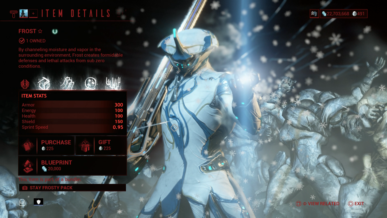
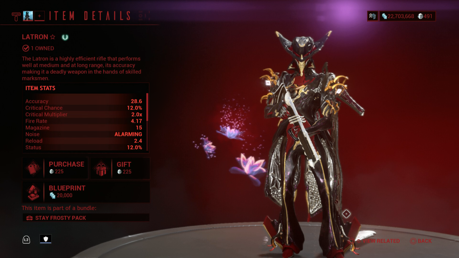
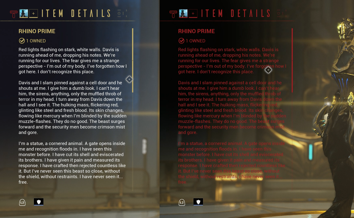
As an example, this is the Codex entry for the Latron:
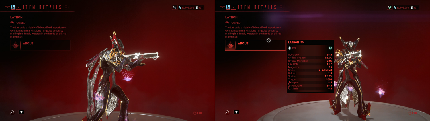
Only the name, number owned, and blurb is readily available at a glance. The real information a player would want is nested under the “ABOUT” button.
This is a pointless hiding of vital information. What’s more, from a design perspective this approach is visually unbalanced and unattractive. The dead space haunting the screen under the “ABOUT” button makes what text and information already present feel like it is cutting in on or oppressing the diorama. This is not helped by the uncontrolled shifting and zooming in and out of the diorama camera. Further, the information pop-up bites directly into the diorama itself, obscuring it when so much effort is made to make it the focus of the screen. All of this could be easily fixed by simply moving the stat information to under the name and blurb, where it will fit with little trouble. To further aid with visual balance, the diorama itself could be scooted over slightly to shift from the dead-centre of the screen to enforce a layout closer to the golden rule of thirds - giving greater visual appeal.
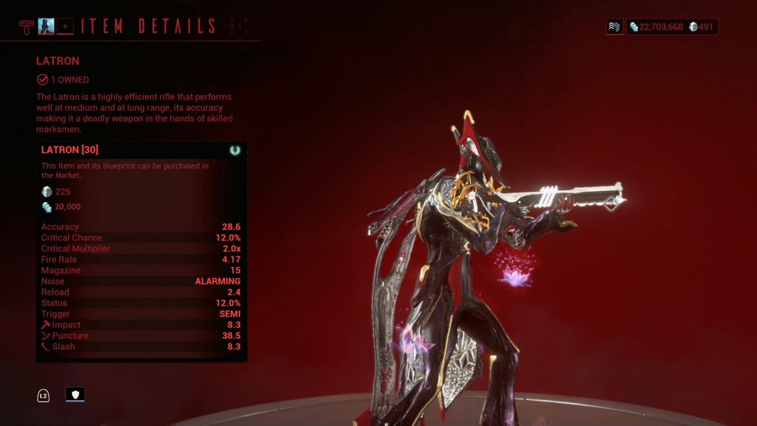
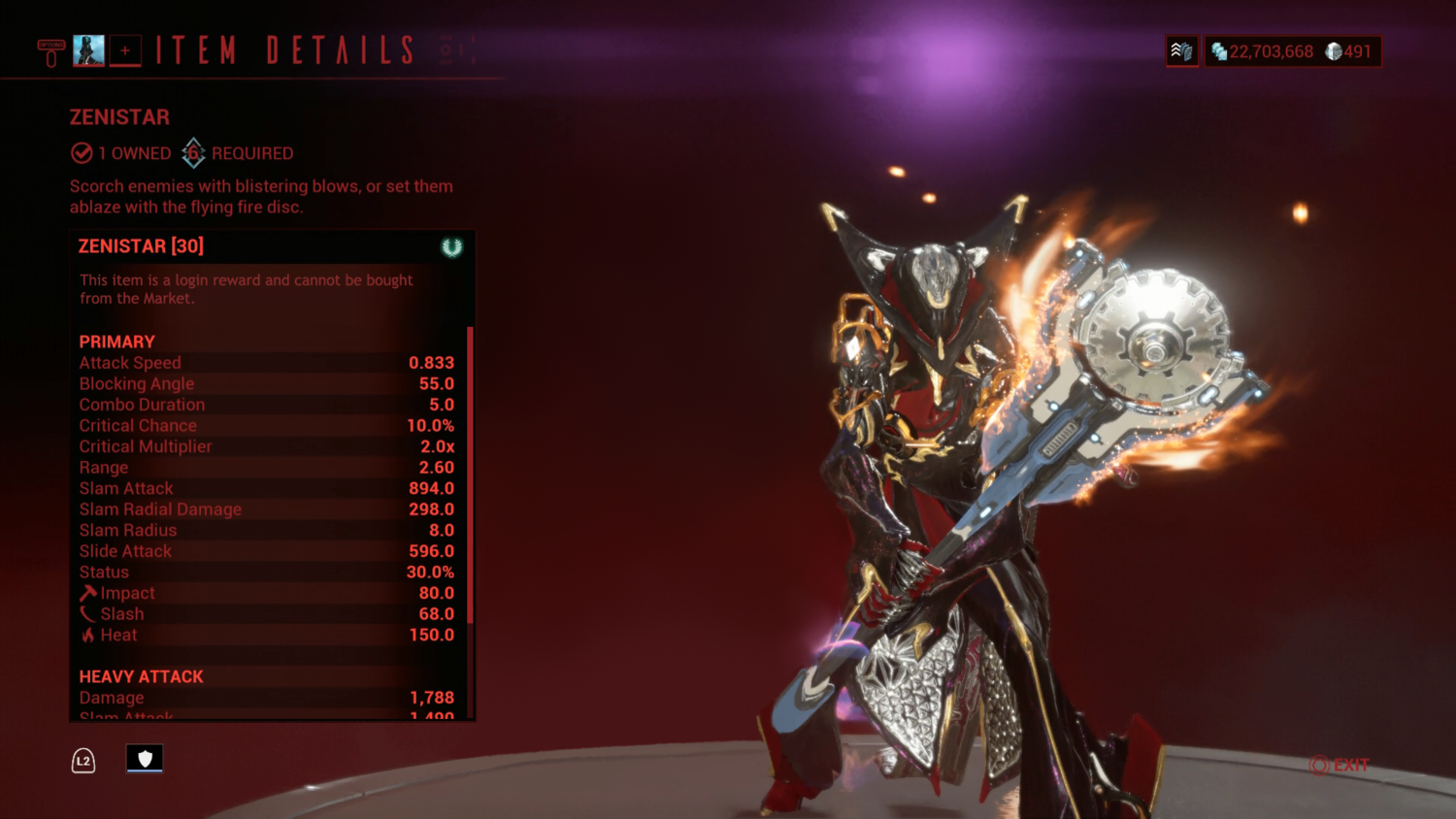
Here, all potentially desired information is present - the weapon name, blurb, number owned, rank and Mastery, where to obtain, item price in platinum and credits, and stats. In the event of a larger stat spread, such as with a weapon like the Zenistar, which as an added detail cannot be bought from the Market, a minor change to the acquisition description and the addition of a scroll bar accommodates all relevant information.
Elsewhere in the Codex, Warframes are treated similar with vast portions of the screen left as dead space - prime real-estate for information left unused.
The same issues with diorama centring, lack of visual balance, and tooltips biting directly into the diorama itself occur here as with the weapons.
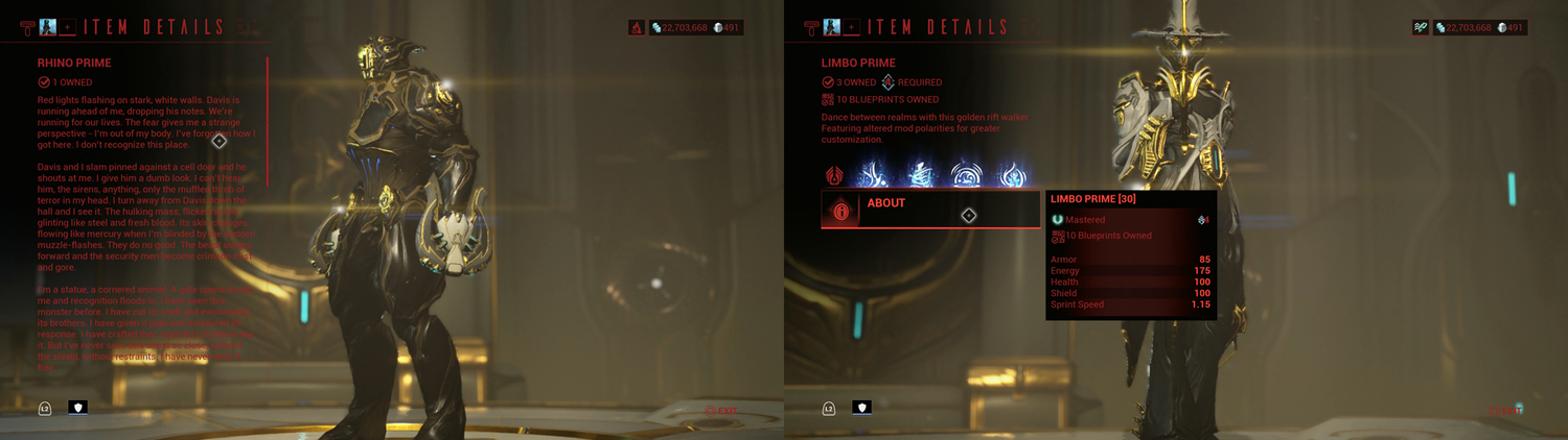
As an added note, the Rhino Prime Codex entry in particular has exposed is how poorly the UI "themes" are balanced due to the UI's design and overreliance on "being pretty" through unnecessary gradients and transparency fields. The Stalker theme suffers quite a bit due to this, and to a degree makes me regret paying for it since, despite it being my favourite theme, the current UI design makes the basic experience of navigation and reading of information difficult unless the background the text is sitting on is overwhelmingly dark.
It is clear that the UI was designed specifically around a single colour theme, the Vitruvian Theme, with other themes simply swapped in without consideration for how the new colours would interact with the UI backgrounds and backdrops. Hue is not equitable to brightness. Red may be considered a “strong” colour, but it is not a “bright” colour. Red, blue, purple, and green are not “bright” colours - they are saturated - chromatic, “strong” colours. Desaturated, they become grey - a midtone. Midtones over midtones are difficult to tell apart regardless of their chromatic strength. The best way to see this difference in action is through a saturation comparison:
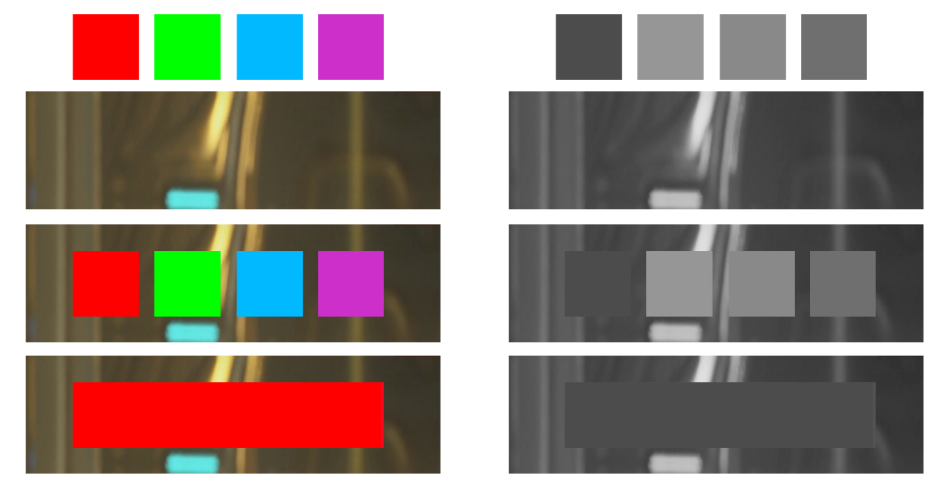

This is colour theory. The proper balancing of colours should be at the forefront of the mind of a UI designer if the ability to swap colours for aesthetics is an option, especially if that option is locked behind a paywall. Ultimately, what is given is irresponsible design, especially when players are asked to pay Premium - real money - for these themes. This makes me incredibly reluctant to purchase any of the remaining UI themes as a player.
Each of these aforementioned issues could be rectified similar as before, with an added reach of gradient to give the heavy text of Rhino Prime’s lore entry a properly contrasting background to allow the text to pop for darker colours.

As an alternative, the abilities of a Warframe in the Codex could be aligned vertically on the right side of the screen, like they currently are in the Arsenal overview.
Inventory Critique - "90% of What is Available" Does Not Equal "90% of What is Used"
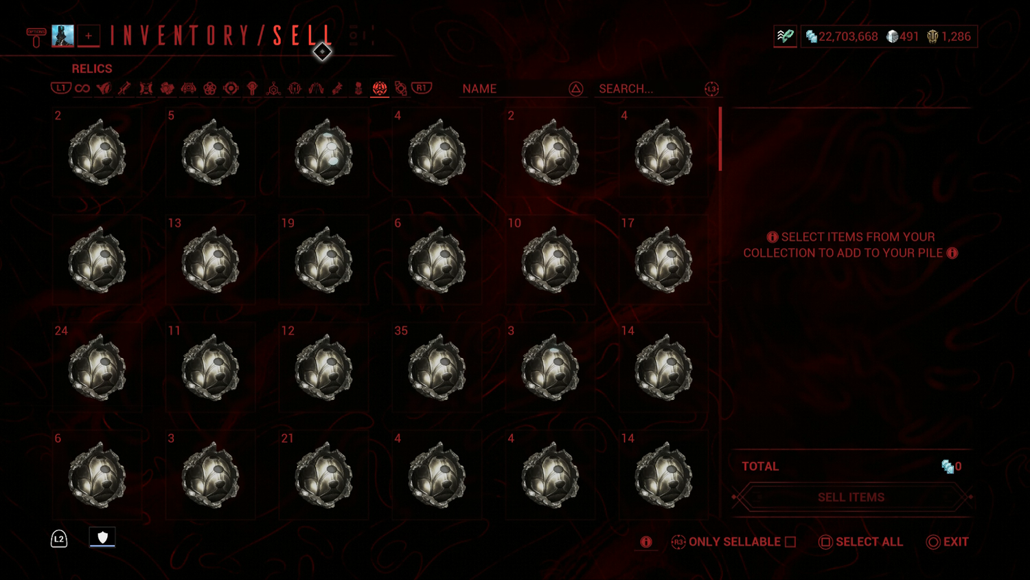
In the UI update thread made by Pablo, the reasoning of "90% of our items have recognisable icons" was given to justify the decision to have item labels turned off by default. This reasoning sounds good on paper, but in practice is woefully inadequate considering the kind of information a player is likely after when browsing their inventory. Icons are for identification, but that is only half of the equation - the other half is relevant information. The icons in Warframe do not give relevant information, at times they don't even do the basic task of identification, because the vast portion of items that the user base interacts with the most in the most impactful way - trading - is hamstringed by the use of universal icons. Players trade Prime Parts, Relics, Mods, and Arcanes.
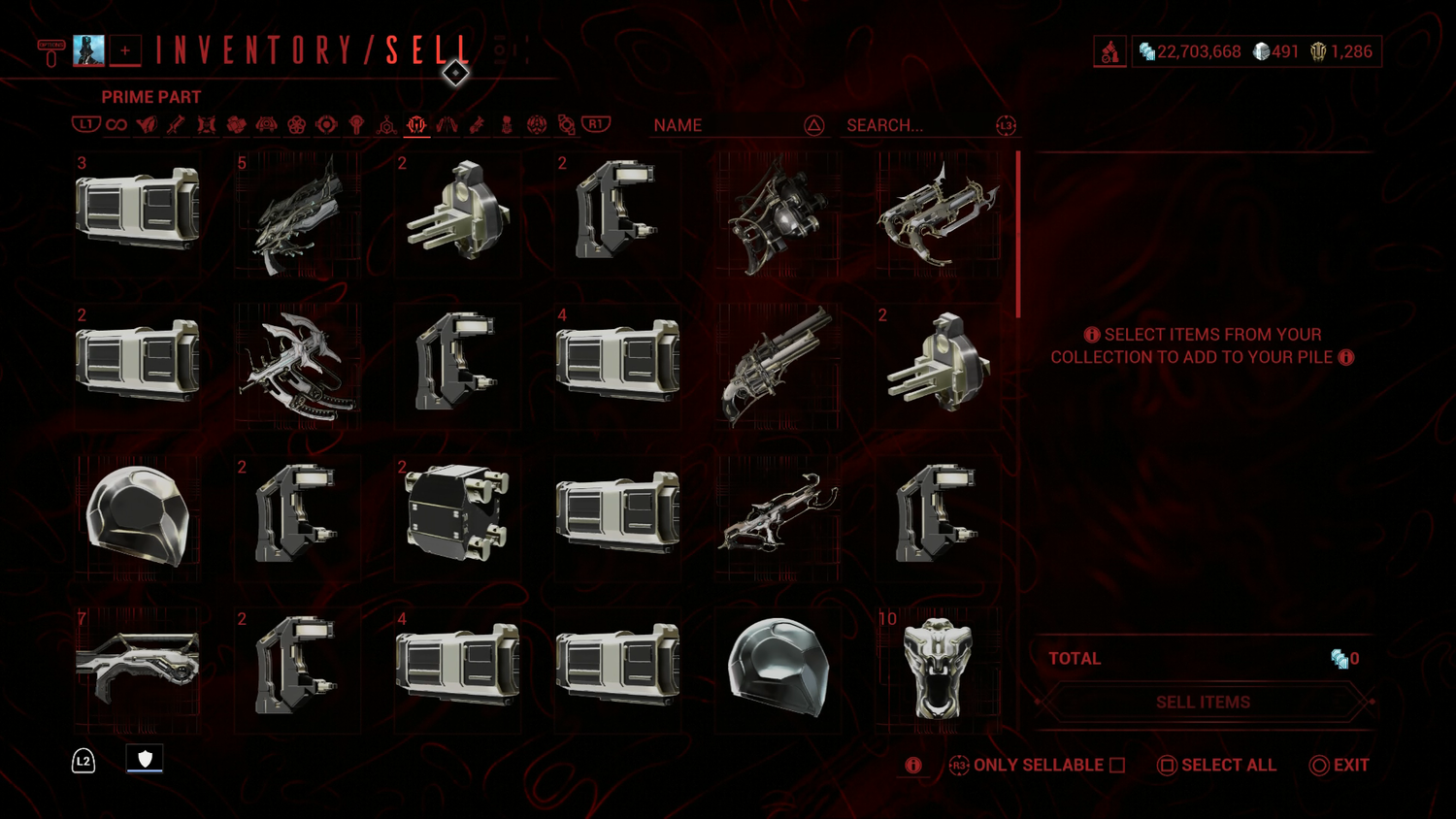
This is the Prime Parts tab of my inventory:

This is the Prime Parts tab of my inventory without labels:
This is the Relics tab of my inventory without labels:
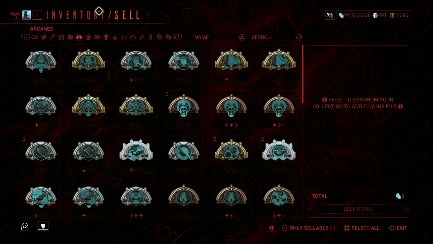
This is the Arcanes tab of my inventory without labels:
There is a very noticeable lack of information in each of these screens. Players who trade regularly get the brunt of the UI’s lack of user-friendliness. Without labels, these all-important trading items become opaque guessing games. Relics and Prime Parts, items that span into the 100+ range of individual items and which take up the majority of trading, boast only a handful of unique icons. Labels are absolutely required to quickly and efficiently navigate these items.
A unique issue here is Arcanes - Arcanes have unique icons, but these icons give no information. Unless you have the game’s many Arcanes memorised, an Arcane's icon tells you nothing about the Arcane itself. The icon describes nothing of the Arcane's ability - using vague symbols and shapes to describe a very specific effect, and even if you might be able to infer an ability relation, you likely won't infer the actual ability by icon alone.
A special mention needs to be given to the resources and weapons inventory:
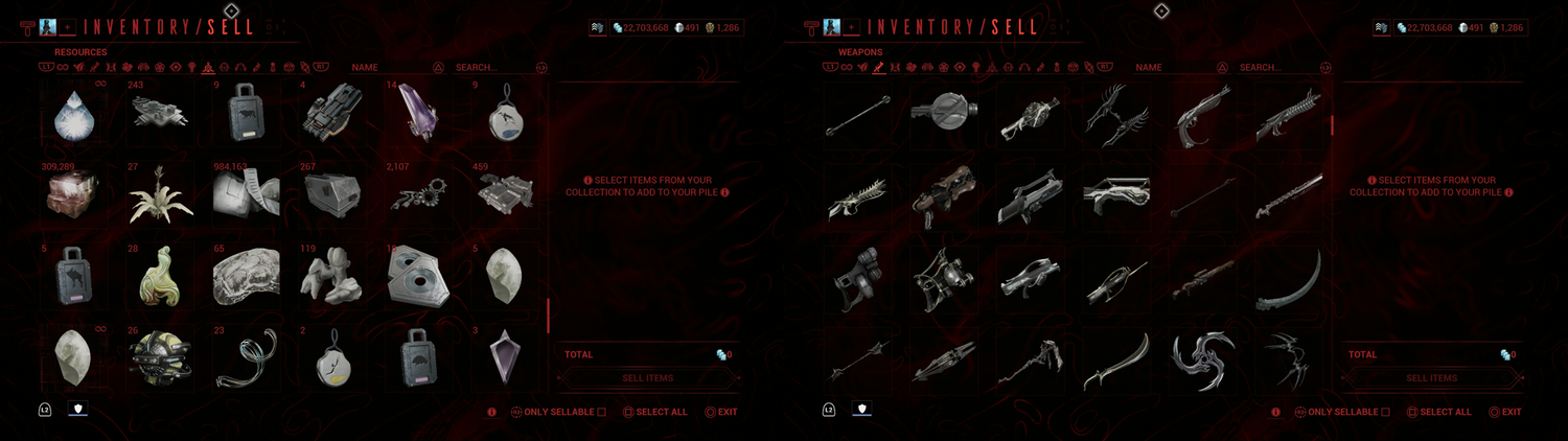
Again, having a unique icon does not equate to readability and clear information. Without labels these items are opaque in meaning and use. Further, players do not search their inventory by icon, they search by name - something all but required due to the game possessing over 250 unique resources, over 300 weapons, and over 70 Warframes both plebeian and Prime. A player is more likely to recognise a weapon, resource, or Warframe by its name rather than its icon, in part because an icon of a weapon or Warframe can be affected by cosmetics - skins specifically. Resources are a jumble of shapes with no pattern or immediate meaning and often no relation to an identifiable real world equivalent. Plus, when a player hears or learns of a resource the first time or just in general, they will learn of it by name first, either as a required component in a crafting recipe, a requirement for rank up with a Syndicate, or, most likely, as a line of text at the bottom of the screen in the midst of a mission as a pickup, or as a part of a list at mission end.
A player will remember a name easier than a shape when faced with such a vast number of items. Labels are a key form of accessibility in an information-dense game. Having this feature disabled by default is a barrier to understanding that greatly affects players new and experienced. In relation to the New Player Experience specifically, a new player is not going to know that the option to turn on labels for their many image-dense screens is present in the Options menu - a menu that itself is choked with information in the form of sliders and toggles. This specific option is itself all but hidden behind multiple tab-overs, largely invisible for the questing initiate for whom Warframe might be their first experience in the looter-shooter genre. Lack of information is poisonous to the New Player Experience, it can convince a player that they are simply not “smart” enough for the game, when the issue at play is the game making itself impenetrable and inaccessible by hiding vital information from the player.
Further, inaccessibility as an issue is also prevalent in perpetuating Warframe’s many “content islands”.
Lich and Requiem Critique - Unnecessary Segregation Defeats Accessibility & Enforces Content Islands
The Kuva Lich system is one in need of overhauling in more ways than one. One part in particular relation to this thread is the accessibility of the Requiem system. Currently, the Parazon modding screen - required to gear up to take out your personal Kuva Lich, is utterly divorced from the Lich screen - where the Requiems required to properly gear yourself to face your Lich are displayed. This in itself is a pain. Being forced to take three steps when only one should be required is bad enough, but before a player can even start piecing together their Lich puzzle, they’ll be greeted with this:
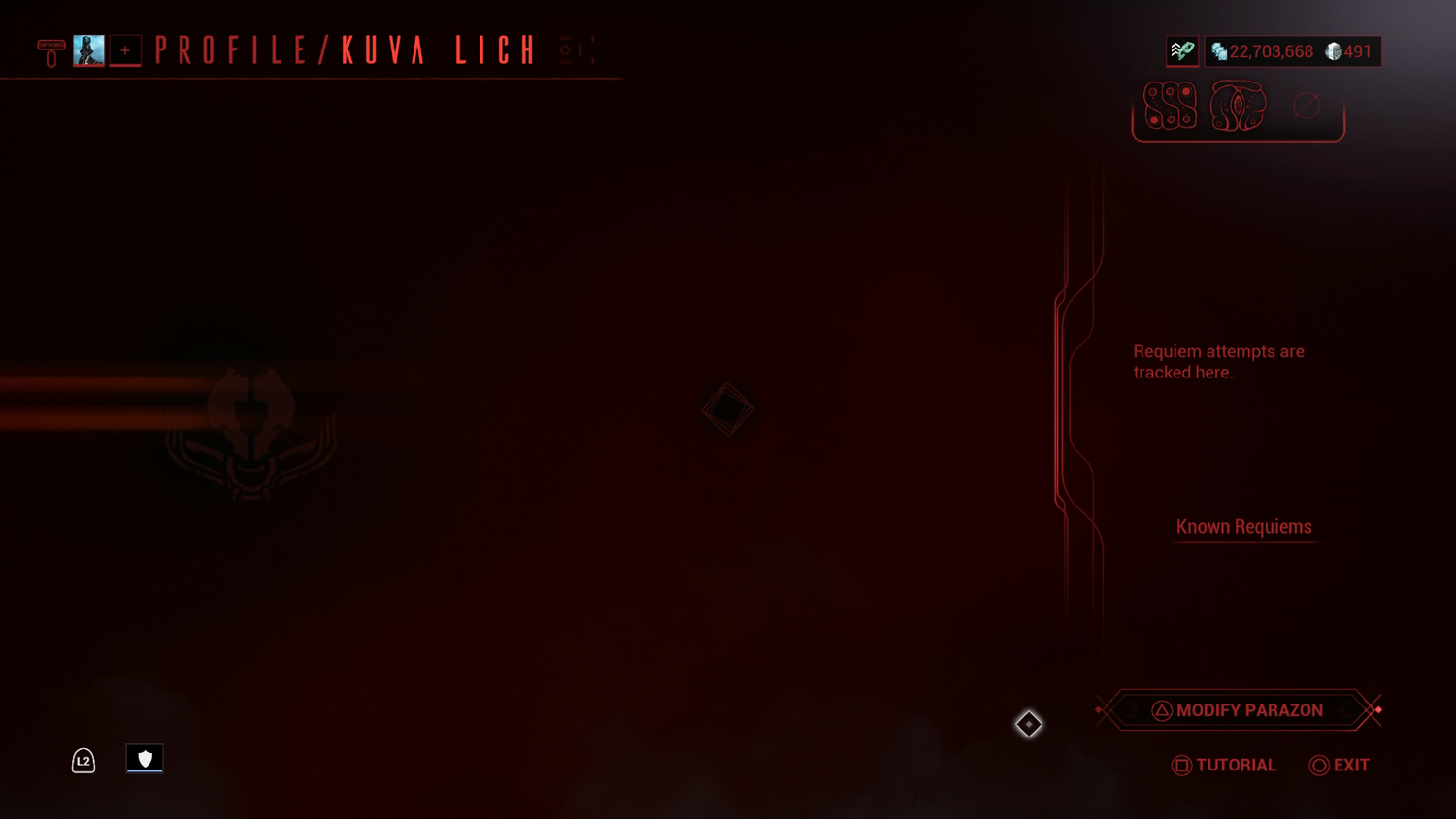
Before finally seeing this:
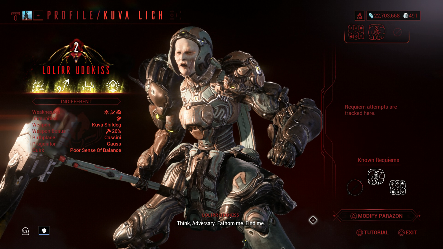
Warframe’s load times are not especially quick, at least not on console, so this extra holdup to get needed information is more than a little annoying. After the creation of a Lich, a player by and large only needs to check this screen once, to see what their Lich’s stats are, their weapon, and if they have an Ephemera.
Outside of this screen a player’s Lich by and large doesn’t exist. The Lich makes a quip upon player login and steals 5 Rubedo per 100 if the player decides to play a mission in a Lich-controlled territory. Aside from this, a Lich of any Rank can be safely ignored until they steal Void Trace. The tragedy at play here is that this setup as it currently exists, both in gameplay and UI, is utterly isolated from the rest of the game’s systems, but it doesn’t have to be. The Lich system is meant to be opt-in; however, there is a difference between opt-in and being dismissed or forgotten. The easiest way to enforce a system as a part of the game is to “be present”. The Lich system attempts this with quips, quotes, and an NPC being an especially petty thief. However, this fails due to the Lich overall being easy to simply dismiss and ignore, the Lich doesn’t involve itself with the rest of the player experience. This is made worse with the Requiem system, because it makes itself inaccessible through unnecessary screen-hopping and an already-mentioned readability issue - indecipherable icons.
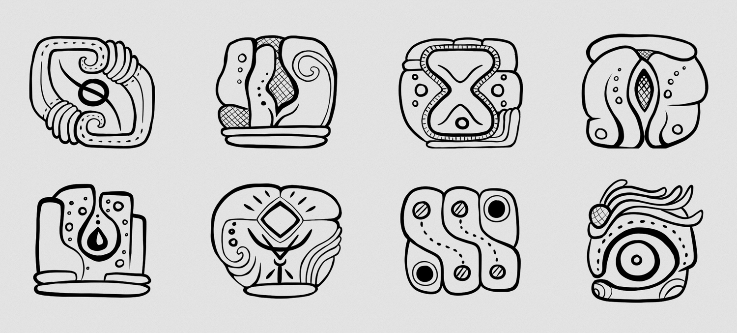
The icons of the Requiem Mods are unique and recognisable - players will quickly identify them as “a part of the Lich system” once discovered and their link to the player’s inevitable first Lich realised.
However, these icons come with two issues mentioned towards the beginning of this thread: no innate real-world relation, and being incomprehensible without labels. The art direction of the icons is a clear homage to Mayan hieroglyphs, but said hieroglyphs are a language - a full language with deep history is not as accessible as a basic symbol like the icon art of the acorn in Breath of the Wild. Requiem icons are “otherworldly”, the player has no basis with which to compare them either in-game or out-of-game. This is fair to consider intentional, as the Requiem system is roughly described as a “triad of commands that sever a Lich’s link to their Continuity, rendering them mortal.” All of this sounds quite mysterious! Mysteriousness can be fun, but balance is still important.
Despite their recognisability as a set, Requiem icons are difficult to place a name to individually, because whenever they are shown to the player their name is not shown alongside with them unless sought out through cursor hover. On the Lich screen, we are shown the icons, but not their names. The player can learn the name if they hover over the symbol, but that isn’t immediately apparent. After this, the player is tasked with remembering this strange, very complex icon and either head to their relic module to see if they have a Requiem Relic with a matching reward, or to their Arsenal to search for the mod for their Parazon.
Currently, the Parazon screen looks like this:
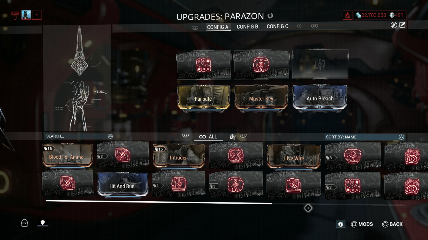
The Parazon screen is integral to the Lich system, but is kept divorced from it in a major way. I can switch from the Kuva Lich screen to the Parazon screen, but I cannot access my Lich screen from my Parazon screen. On top of this, the information I want from my Lich’s screen that is related to my Parazon screen should be readily accessible there, but isn’t.
The Parazon art present in the left-side panel is nice to look at, but serves no functional purpose. Similar to the “BUY” and “ABOUT” buttons, this drawing takes up valuable screen real estate that would be better utilised in another, more informative way. While a player has an active Lich, that empty space would be better used as a form of connective tissue between the island of content that is the Lich system and the rest of the game.
For example, Requiem progress and attempts, along with Lich name and a button to switch to the Lich screen, could be implemented on the Parazon screen neatly:

Transplanting or copying the Lich Requiem information from the Lich screen to the Parazon screen would not only aid in accessibility, it would also greatly aid in making the Lich more “present” by being a more earnest reminder that the Lich exists. Every time a player opens their Parazon screen they will be reminded that their Lich is still alive and what their progress to the Lich’s defeat is. This could act as a great potential motivator while helping to remove the unneeded burden of trying to hold and remember complex icon designs between screens. While this change would help make the process of getting the player engaged in the Requiem system more readily, it also makes the revisiting of the Lich screen itself more of an event, something comparatively “special”. A player can ask themselves “I have my Parazon Requiem set, but how is my Lich actually evolving?” and can act on this by engaging with the Lich status screen by way of an easily accessible button.
The combining of disparate parts in this way may seem counter-intuitive to streamlining or minimisation, but overall helps with accessibility, connection, and system-relation.
Railjack Avionics Critique - "Overwhelming" Does Not Necessarily Mean "Too Much Information"
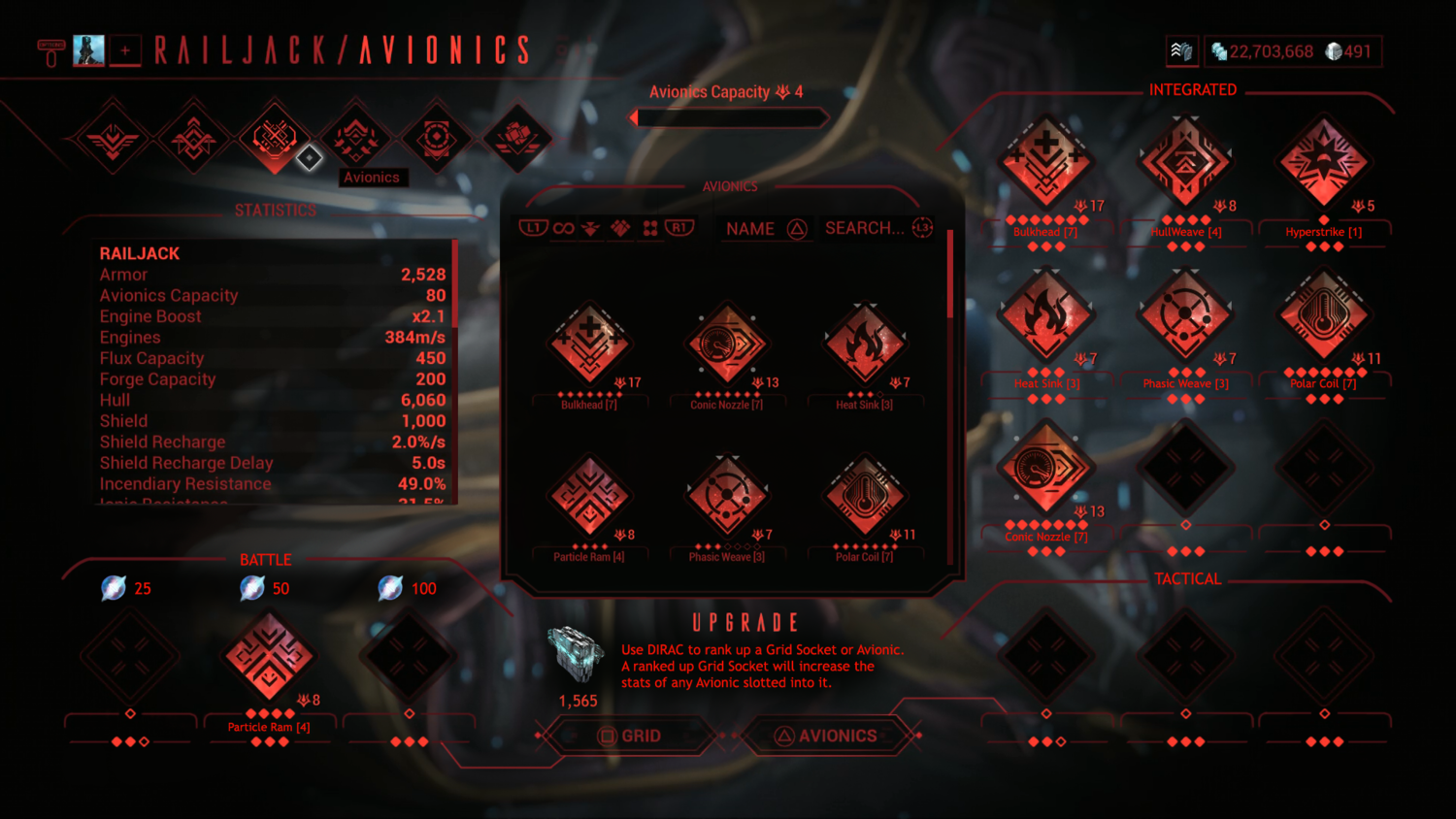
A reason given by Pablo to justify the current direction of UI changes was that players were feeling "overwhelmed". No context was given on what "overwhelmed" meant, so I will present an argument here that I believe that "overwhelmed" is being interpreted in a potentially incorrect and detrimental way in context of a user base that needs and desires information to be presented in a concise and accessible way, which Warframe's updated UI has been failing to do. As an example, I bring up the Railjack Avionics UI:

This UI, while nice to look at, is overwhelming, but not for reasons you think. This UI by itself presents no information - no up-front clue as to what its purpose is or what part of this UI plays what role or means what thing. Sure, we have ship stats visible here, but that's it. The information that tells us what this UI and set of grids is actually for is hidden behind a tooltip that can only be seen with a button press:
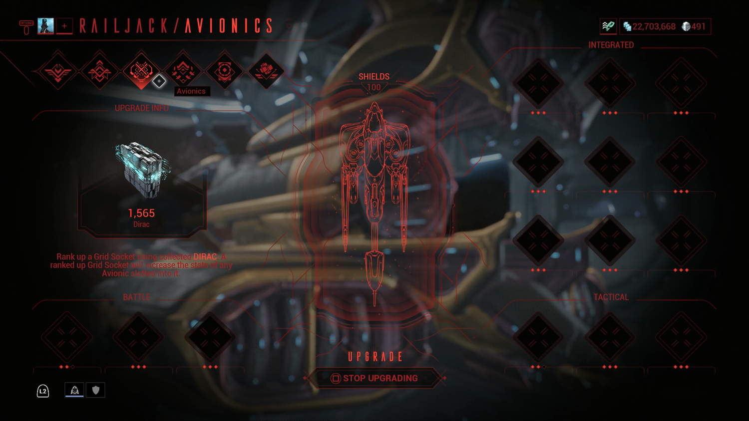
This piece of information should not be hidden, it should be in the open, readily available for the user to see to tell them exactly what this UI is all about.
Much like the Market, Codex, and the Parazon screens examined earlier, this UI cripples itself through liberal retention of needless dead space and assigning of prime information real estate to buttons or diagrams that serve no functional purpose equal to the space they occupy. The Diagram of the ship smack in the middle of this screen serves no purpose, and neither does its "SHIELDS" field, which does absolutely nothing.
The complete lack of concise communication is a part of what makes this screen “overwhelming”. The amount of things to see is overwhelming because nothing makes immediate sense. We have a stats screen and also a diagram showing “SHIELDS”. Why is “shields” listed twice? Why are the values of the “shields” different in the stats window versus this drawing? How does the grid affect my avionics? Where are my avionics? How come I can’t see them right away like in the mods screen? Why does everything need to be clicked to be seen or made sense of?
Dirac is integral to the Avionics system, but is kept hidden behind the stats screen, accessible only by pressing a button instead of being front-and-centre for accessibility and immediate recognition as a part of the system the same way Endo is for mods. Avionics can’t be seen unless an individual grid is clicked on, and even then you don’t get to see your full collection, because what grid space you click on dictates which avionics the player gets to see, which by itself is a small nightmare in terms of functionality and accessibility on its own, never mind that this is compounded even worse by the Battle Avionics section alone, which requires each grid to be clicked on for a battle Avionic of the appropriate “power” cost of 25, 50, and 100 Flux respectively to be seen. Despite this very important detail, nowhere on this screen is this vital information shared.
All of this contributes to a player being “overwhelmed”, because the UI itself makes absolutely no effort to explain itself. The player is left to essentially flounder and hope they do not “make a mistake”. The purpose of a UI is to inform the player, not to frustrate and confuse them.
A proposed set of changes:
While crowded, the grand majority of information needed is front-and-centre. This crowded design can be considered justified, as by this stage of the game a player would be fully acquainted with Warframe’s other screens and systems and would be able to parse this screen with relative ease. For a player new to Railjack, this screen would be “empty”, but still readable with valuable information to help them come to grips with what is an entirely new system primed for the experienced player. Additionally, if they have not played any Railjack missions, they will be given an immediate goal to seek out “Avionics” and “Dirac”, named explicitly right where the text block and the unfamiliar, new icon of Dirac is located, drawing in the player’s eye.
Complex screens can be made readable through guiding the eye and placing vital information where it cannot be missed. Because a player’s access to the Avionics screen is gated behind the building of the Railjack itself, which is itself further gated by quest advancement and time investment ideally leading to deeper familiarisation with Warframe’s systems overall, it can be safely assumed that players that have advanced to a point through time and investment to reach such a screen would be prepared to regard it for what it is, a complex tool for a complex system.
Conclusion - A Sincere Ask For Reconsideration
The current form of Warframe's UI changes are heavily undermined by their lack of functionality. The aesthetic streamlining hides a clunky and obfuscating nature that is a detriment to the player experience old and new. The parcelling of information into nested tooltips and detached "ABOUT" buttons makes that information difficult to access and compare on the fly, making the game's wealth of needed information "overwhelming" to parse due to an inability to just see it all and understand from a glance what is actually available to the player. A lot of information at once can be intimidating, but players need to be given the chance to see that information and the nature of the game for what it is.
The UI as it currently stands speaks to an attempt at a rejection of Warframe's identity as a deeply numbers-driven looter-shooter. To hide its complexity under a veneer of "minimalism" is an action that actively gets in the way of player familiarity and utility. This veneer will not fool an experienced player, and it will not fool a new player who either already knows or has yet to discover if they want a numbers-driven experience or not. If anything, this attempt at hiding vital information will frustrate and drive players away - how trustworthy or useful is a system that hides information from you, the veteran or new player?
DE, please reconsider the direction you are taking with Warframe's UI. Warframe is an information-dense game. Your target audience wants and needs this information, and is smarter and more capable of accepting and taking in this information than they are being given credit.
-
10
-
-
46 minutes ago, [DE]Pablo said:
Why is item labels a setting? And why is it off by default?
Not gonna lie, sometimes I ask myself this very question too 😅. Our logic was that 90% of our items have very recognizable icons, we looked at some of our contemporaries at the time and none of them had labels for items, and most of them had smaller, less unique icons than we did, so we felt comfortable removing labels.I'm going to hard disagree with you here, Pablo. Having unique icons isn't a good reason to have labels off by default. We don't have as many unique icons as you think, and they don't provide the information we actually need as players. We have unique icons for stuff like Warframes, Weapons, Campanions, resources, Arcanes, etc. That's great, but it doesn't mean those unique icons actually give us the information we're looking for when blasting through our inventory looking for something. Yeah, I'm looking for a Warframe or Weapon, but I also want to know at a glance without having to hover or click, what the Rank is, how many I have, the name, etc.
Example 1: I have three Limbo Primes in my inventory, because I have a bunch of builds and fashion I like to keep. When I search for these frames in my inventory, they all look the same despite that fact that they all have unique skins. In the old UI, the unique skins I gave them changed their UI icon. With the new UI it doesn't do this... 99% of the time. Sometimes it does, but not often enough to make a difference. Even with labels on I can't tell which Limbo Prime's which unless I load it into the Arsenal. To work around this I just wound up saving them to load outs to spare myself the headache of trying to tell which is which.
Example 2: Carrier and Carrier Prime will look exactly the same in the inventory with the Para skin equipped. With labels off I have to hover or play a guessing game for which is which.
Example 3: Arcanes, Relics, Prime parts, and basic parts. All of these look the same if not exactly the same. They need labels. Arcanes are indecipherable without labels. Arcane Energize's icon is a bunch of dots - that doesn't describe the Arcane or what it does at all - it's label does. I still have to click on it to get the full picture, but from the name alone I can get an idea. Relics are differentiated by refinement and colour - that minor differentiation would be great if I didn't have over 2,000 of them in my inventory. Same for Prime parts and basic components - ALL of these share the same basic set of icons.
And, what about resources? They have unique icons too, but when push comes to shove, I'm not here to admire the tightly-packed icons, I'm here to see at an immediate glance What I have and How Much.
Labels should be on by default. Having it off by default is incredibly non-user friendly and is a barrier to understanding for new players who don't even realise this information can be turned on in the menu - an option buried in a dense and tabbed menu. As an experienced player I still have issues finding what I need in the Options menu. DE has spoken many times about how they want to bring in and retain more new players - having what is an impenetrable UI choked with vague information with no labels by default is poison to the New Player Experience. To turn them off should be the choice for those who specifically want it, not the default.
To further build on this, you've even shown why having labels off is a terrible idea in this very post:
1 hour ago, [DE]Pablo said:And finally we are adding more flavour to it by showcasing your whole squad.

This is nice and all, but the right side of this screen? No information at all. What did I actually get? I have no clue! I have credits, endo, some resources and some prime parts. Which ones and how much? I can't tell. I am honestly and seriously baffled at how and why anyone on the team believes that this is an appropriate change - to strip needed information from an information-dense game. UI is art, but form and function need to be balanced and married in a way that benefits the end-user experience - us, the player, not the art critic. Dispensing critical information is in and of itself an art form, and currently the changes to the UI are a class in what not to do in a circumstance where a lot of information is needed quickly. This screen by itself is a massive counter argument for labels-off-by-default all on its own. Stop making us jump through hoops to get our information. Hover is not a catch-all solution. There are so many screens in this game where there is massive chunks of dead space that would be perfect for information and graphs, but are entirely empty save for an "I - About" icon pasted right in the middle. What do I get when I hover over this ugly button? A tiny graph that would easy fit in that dead space with no detriment to the design of the page. The market and Warframe Codex are the biggest culprits of this bizarre and non-functional design choice.
Can the current screens be updated? Yes, but taking out all of the information in favour for a dense grid of nice-looking tiles isn't the answer. A marriage between these two extremes could be reached instead of this.
It's likely been mentioned in this thread before, but all of this "info by hover" is great for PC but is incredibly crappy for console players / controller users, in part because in many cases, especially in Railjack, the active area we need to hover over is small, and a controller pointer is not accurate. Added to this, functionality of the d-pad as a form of hover-point navigation is broken at best still.
-
2
-
-
This.
Ephemera were supposed to be earned by "skill and dedication" according to the dev team when they were first shown off on stream. RNG is not skill or dedication, it's just luck with the sole affecting factor being time and how much you're willing to waste to get that Thing. Getting something like Ephemera by RNG doesn't make it feel "special" as a reward, it makes me feel like I lucked out and don't have to deal with the dice-roll again, that's it.
I want to work for the Ephemera in a meaningful way, not pray to RNGeezus to be blessed with a good roll, that's bad design. Tokens are already a suggestion and I'm all for it (tokens for Sorties when? I'm sick of Rivens and Kuva). Tokens are a fair reflection of dedication and skill by themselves, but I'd also be down for something like an opt-in heightened challenge that the player gives themselves.
Example: Liches. Liches suck to grind. They have multiple layers of RNG inherent to the three things players would want from them: weapons, weapon bonuses, and Ephemera. We're getting a fix on the weapon randomisation, but what about the Ephemera? 10% chance to have your Lich spawn with an Ephemera isn't skill or dedication, it's luck only, I have no say or ability to influence whether my Lich spawns with an Ephemera I want - but I should. I should be given the option to make a choice to show my skill at the game by making my Lich stronger in some specific, special way (not Ranks, something else) that transforms the Lich itself and gives that Lich an Ephemera that I can claim as my own if I can answer this new challenge I initiated. This whole system is supposed to revolve around Kuva, yet there is no Kuva involved. I have 150K Kuva languishing in my inventory, let me dump 30K of that onto my Lich or something to turn them into a monster that will give me something special upon defeat (the Ephemera). Liches aren't difficult to deal with, they're a boring slog of a surprise egg that is easy to throw away.
-
2
-
-
I was expecting more than a series of exterminate missions with a slapped-on secondary (sometimes tertiary) objective. I was in denial while making my way through Earth Proxima that that was all Empyrean had to offer in terms of mission gameplay. When I finally got to Saturn and it was nothing but skirmish nodes with the exact same enemies all over again (just with different names) I actually said aloud "...is this seriously it?" I burnt out on this mode pretty quickly and just have no desire to touch it again.
Outside of the Alpha-state of the release and the absolutely awful RNG system, overall Empyrean has just been disappointing. Yeah, we're supposed to get Empyrean in phases, but at it currently stands I really wish they hadn't rushed it for a holiday release knowing the state it was in. It didn't look ready when we last saw it previewed on the Dev Stream, and that was in controlled conditions. When we did get it, we got immortal enemies, enemies not spawning, clients getting the absolute worst in terms of functionality and lag, terrible UI and a host of other things. It was clear this wasn't tested and just let out into the wild as-is. DE has a lot of work ahead of them and with their current cycle of "push out the next big thing as soon as possible" and the release state of Old Blood right before it, I'm dubious on whether they can actually fix this mode before we're legitimately forced to use it in New War (please, no more skirmish missions) or just in general.
-
5 minutes ago, Awazx said:
Perhaps it is the only way DE has found to monetize your game and I will not question it. For 6 years I bought reactors in the store for Waframe and nobody has complained. I don't see any difference having the same option for the ship. DE needs money and I less RNG; it seems fair to me.
These two things are not equal. "Nobody complained" about you buying Orokin Reactors because they aren't a thing earned via normal gameplay, Railjack reactors are. Railjack reactors are locked behind multiple layers of RNG to encourage people to play the new mode. To sell the best-performing reactor for a flat price in the shop would show the playerbase that DE put in this obtuse and poorly implemented system on purpose to encourage us to buy the parts instead of playing the game. It would defeat the purpose of Railjack's entire gameplay loop / system as a whole to do this.
If you're so eager to burn plat, just wait for the blueprints to be tradeable and pay someone for their duplicate.


Nightwave: Intermission III Is Now Live!
in Announcements
Posted
Where did you hear that Intermission III will be ending in a few weeks?