

Ganek
-
Posts
34 -
Joined
-
Last visited
Posts posted by Ganek
-
-
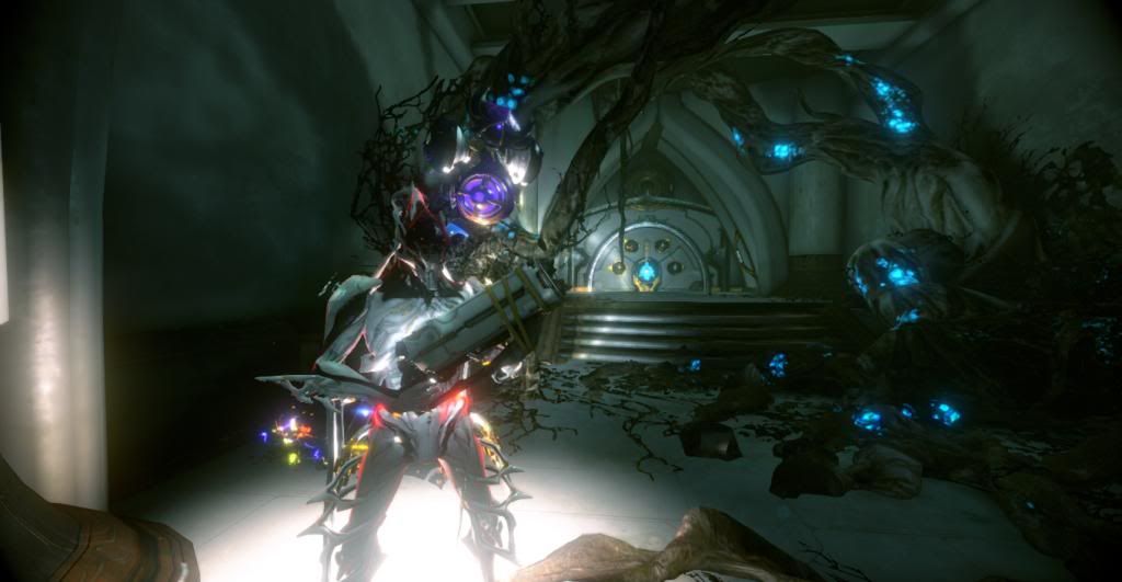
Click the thumbnail for a full view picture.
Warframe: Ganek
Sentinel: Lil' Lotus
Motto of the day: "Walk softly...and carry a big gun."
-

This needs to happen in game.
-
Noticed this myself last night, farmed Nova and Sayrn in six runs. Bargain.
-
Before this devolves into a back and forth argument over the aesthetic choices of the new arsenal (for which there is no right answer. Everyone has different personal preferences), let’s look at it objectively.
While _Tiamat_ has laid out his argument in a witty manner, most of what he has said is neither right nor wrong; it is simply his preference conflicting with the developers decisions. That said, DE would have made these changes for a reason, so let's what’s been said:
- Unused Space:
The large middle section is absolutely for model previews and colour adjustments. Before, when editing the physical appearance of your sentinel or the colours of your frames/weapons. You'd often get parts of the weapons either appearing off screen or behind the option boxes. For those particularly artistic (read, sometimes fussy) it could be a nightmare trying to get the colourings just right. On top of that you had your warframe set against the default backdrop of space swirling behind you, I can tell you from experience that’s not so much fun when you’re trying to paint stuff black. Now you have everything in plain view and you are able to rotate both your frame and sentinel separately. The system is better because the models don’t clash with the option boxes to such a large extent as they did before and everything is easily distinguishable from the background. However that said, what about players for whom the models don’t matter? The only information they care about now takes up far less space at the upper left and lower right corners/sides. Primarily: their loadouts and relative stats. This is something that can easily be adjusted, I’ll come to again under ‘Size’.
Personally I must admit, I prefer the model views, I like looking like a bad &#!.
- Style:
The general and constant change in style is something that will always occur, whether that be variations in colour pallets to font choices. I've noticed recently all mods have changed their font layouts. At the end of the day though, this isn't exactly a dire difference nor will it actually impact anyone’s gameplay. DE aren't going to change the background colour to be pink with yellow polkadot spots. They've decided on a neutral setting so that everything is easy and clear to present to the player. While this may impact players with different resolutions for whom the size has become unbearable to read, it again comes down to nothing more than the fact you can't please all the people all the time. Back before options were a choice or before games had HD TV’s, if your resolution was so small you couldn’t read the text, your only option was to buy a bigger screen. I think it’s safe to say those days are long gone, even still there’s always room for improvement as shown under ‘Size’.
- Floating menus:
It's obvious to see these would have been chosen so that they do not obstruct the model preview space as commented on above. If you don't care about revives/upgrades or appearance, why put these buttons in the way? It was a design choice to simplify the appearance and frankly doesn't impact gameplay that greatly unless you are changing gear.
Which actually brings us to our first negative change that isn't mere preference: The loss of the ability to double-click an item in order to change it. I doubt I'm the only one that double clicks something to equip a different item before remembering to go through the new UI. It’s an old habit sure, but it’s also an easier way of doing things.
- Size:
While unable to test my own client at the moment. I do remember seeing a HUD size adjustment option in the options menu. Whether or not this affects the global HUD or only the in-game HUD is unknown to me. However I would assume it is both. I like it how it is, although completely understand how people with different screen resolutions could want it larger or even smaller.
So an option to look into then: Could it be implemented that we have a separate HUD size slider for the in-game and out-of-game menus that will affect everything from font sizes to buttons. That said, could it also be made an option to limit the in-game HUD display. I don't always want it off but at the same time don't always want to see my warframe and powers in the top right corner. A minimalistic Life/Energy/Mana bar display would do.
- No one gets it right first time:
As it’s been said and even proven by the latest hotfix. DE are still tweaking the UI and it’s obvious that we are going to see more changes in the future as they start to push the new UI aesthetic across the whole client. Some of this tweaking will likely be temporary as they push it out, receive feedback and adjust accordingly.
They can’t leave options open for everything so that you can choose to have your XP bar horizontal, vertical or even diagonal. All they can do is react to the feedback given by players. All you have to do as players is make sure it’s constructive and founded. Saying you want the UI changed just because you don’t like it won’t achieve anything other than rage and hate. Be clear, be constructive.
On the topic of adjustments however: Is it possible to get the affinity bar to run underneath the equipment’s name rather than vertically beside it? I’ve noticed on some names the bar goes behind the text obscuring it slightly. Not to mention it becomes exceptionally difficult to tell if an item’s XP is around the 70’s or 90’s in terms of % complete due to the short size of the bar.
Overall conclusion
I actually like the new arsenal and it works perfectly with the setup I have. That said I’m not about to cosy up to it knowing full well it’s likely to change, nor am I about to start singing its praises when there are likely things that can be done better; even if I can’t see them.
All I can say is thanks to DE for their continued work.
-
Question: Will it ever be an option to choose, say one of three, rewards after doing a void mission?
Stockpiling over 100 Latron prime barrels doesn't help with creating the rest of the prime gear, especially with the latest additions to void drops.
-
My platinum is ready!
Wait...wut...
-
:D
That is all.
-
Hey DE,
Just my two cents:1) Soul Punch: Keep as is. Name and all. The name itself is one of those unique little quirks that will fit within the game and the genre that you were talking about in the latest livestream.
2) Terror Totem: I think would work better as an aura around the warframe much like the moving AoE's that Ember possesses. This would allow for adaptive crowd control to a certain degree as mobs flee in terror from the player. The general freezing tactic alone is very similar to Frost's Avalanche and Vauban's Bastille.
You could even make it a permanent aura so long as the power is activated. IE: Dedicate a certain amount of energy towards it allowing for players to turn it on/off when appropriate. Just trying to get some diversity in the collective squad skill set.
3) Search the dead: Should be returned to life drain. I feel this fits the necromancer theme more strongly and we already have a lot of scavenger aura abilities, bow mods for converting unused ammo and other upcoming releases concerning scattered items.
4) Clone the dead: Could be interesting depending if any enemies are blacklisted. Otherwise imagine taking the stalker into a boss fight with you. (If you kill him of course rather than him vanishing).
As for the Warframe itself. Name it Anubis.
We already have Loki from the Norse myths, Excalibur from the legends of England, Nyx for the Greek goddess of night, lets get a little Egyptian in there. -
Q1) Is there any further word on the recruitment system for friend referrals, that was mentioned in the last live stream? Will there still likely be rewards for this and if so, of what kind?
Q2) Are there any plans to increase mod slot capacity from the current 8 card limit? Is this something that could be achieved once a weapon has reached a certain rank or been infused with certain components?
-
I'm interested in joining. Active daily with lots of frames and weapons.
IGN: Ganek
Tried joining your site, I don't think the account has fully gone through yet.
-
Well I just did my first game solo. (Nobody joined my session ;-;) But got 14mins 13 seconds. So I should imagine even if it's 20 minutes in a single game. It wont be that hard to accomplish.
^^
Just did another. Your profile only shows your single best time. I'd guess that to get the gun you have to survive for 20 minutes in a single game. I'm basing that on the fact that your profile score has been what has determined rewards in previous events.
Good luck people :D
-
Well I just did my first game solo. (Nobody joined my session ;-;) But got 14mins 13 seconds. So I should imagine even if it's 20 minutes in a single game. It wont be that hard to accomplish.
^^
-
Would it be possible to have a diorama viewing the tenno craft from outside. Inside the cockpit we can see a pilot (Rescue mission character?) and the players warframe. The player is pointing to something off screen.
As the camera pans we can see that the character is pointing to Corpus/Grineer/Infested ships where the mission is about to take place.
-
Awesome, it'll make levelling my current ones easy! :D
-
What are you talking about? You're seeing things man.
Enemy propaganda, set to confuse and disorient our troops.
-
What stalker? How can we base an event on your hallucinations?
-
Haha thats awesome

Wow, those live stream comments certainly make sense now...
I wish they didn't.
-
Nova for its teleportation. Really opens up exploration and finding hidden rooms.
Orthos Prime, seeing as how it just got buffed to be even better.
-
The concept of a 'climable' boss is what intrigues me. Considering it has multiple heads, it will be interesting to see how you're supposed to stay on top of it.
-
I'm not sure if this has been reported before. If so I apologise for the repeat.
The long of it is: At some point last week I previously should have had 3 forma blueprints, went in my inventory, found 2 instead. I just put it down to late night gaming mistakes and thought nothing of it.
Having not used either blueprint since, I did a void mission earlier today, it dropped a forma bp and having only just gone into my inventory, I again see the stack only says 2.
Now I know that's not the maximum size of a BP stack because I've ended up with 3 Latron prime BP's today alone as well.
Just wondering if there is a known bug/work around, or that for some reason you can only hold 2 Forma BP's at any one time?
~Ganek
-
It was also mentioned that the Vasto would be getting animations such as cylinder cycling. You can watch the live stream here: http://www.twitch.tv/warframe/b/445705396
-
I lol'd xD
No one cared who I was before I brought on the swag.
-
Dual Paris!
Wait...Wut...
-
Thanks DE, your continued work is greatly appreciated. I look forward to the twitch feed tonight.

Valkitty!
in Off Topic
Posted
Valkitty. She's not the cat warframe we wanted, but it's all we deserve.
(Due to the number of times this has happened it seems to be a bug related to her ultimate. Don't fix it. It's awesome.)