


BurntKitten
-
Posts
45 -
Joined
-
Last visited
Posts posted by BurntKitten
-
-
Please point out where it says this game is still in beta. As of U14, the word beta is no longer included in the version details (and should have been removed when real world transactions became available). You can't simply take for granted that because parts of a system don't work as expected that it is still in a beta stage, that's just poor design.
In regards to testing servers, another discussion was recently started on this and some very good points were bought up, would suggest the OP read through; https://forums.warframe.com/index.php?/topic/267887-what-would-it-take-to-get-a-dedicated-test-server/
-
Someone yesterday posted about meeting random players who were invunerable in a dark sector conflict mission (can't find the link though). Perhaps this is the same bug.
-
only logical response :)
-
Just a conversation that took place today on teamspeak, don't know why but I found it quite amusing for several hours afterwards (easily amused I guess). I'm Muffles btw.
<08:34:03> "Muffles": totes
<08:34:11> "t**********r": totes?
<08:34:15> "Muffles": yes totes
<08:34:19> "t**********r": totes is?
<08:34:23> "Muffles": totes is totes
<08:34:41> "t**********r": wth is totes XD
<08:34:44> "t**********r": what does it mean
<08:34:46> "t**********r": what is it
<08:34:48> "Muffles": means totes
<08:34:55> "t**********r": what does it looks like
<08:35:09> "Muffles": looks like totes and tastes likes totes must be totes
<08:35:23> "t**********r": dafuq -
DE can turn all your palettes to pure green and still you would have no case to get your plat back. It does not matter if it's fair or not, you clicked a waiver, and that is all they have to say.
Slightly off topic, but most countries, waivers will not hold up in a court under contract law (Potest quis renunciare pro se et suis juri quod pro se introductum est; "One may relinquish for himself and his successors a right which was introduced for his own benefit"). Besides, the OP has paid for a service that was altered without notice, of course he has right to a refund or at very least the ability to return to services as purchased.
Back on topic, I logged in to have a look at these new colours and just wow, all the black. Is that purple?* No it's black. I'm very glad this change didn't affect everything and only the frames. Personally I didn't see a huge issue as I could just pick a lighter colour and be done with it. Wasn't there supposed to be some option when we logged in to use the old unsaturated colours though, was sure I saw a post about it.
*Just to clarrify I can't actually tell if it's purple anyway but that's not my point :)
-
Well all those people who said the amount of complaining would drop off after a few weeks with the new UI might be right. So far I haven't seen any indication that the core issues with the new UI ever plan to be addressed.
In a way they are right, but only because 90% of the people who were around in the initial day or two of U14 and were dismayed enough to complain about it have done so already. The remainder is dribs and drabs as new players arrive on the scene, but there is still a substantial amount of voice coming through. Sadly there is very little interest on DE's side to acknowledge there is even something wrong.
We're not talking about a small aesthetic item here, it's the first thing people will see when they enter your game. It's what a lot of people will judge your entire game from, it will be the make or break moment for a lot of players. It's pretty disheartening to see that things like "Fixed a number of Ordis lines getting prematurely cut off" have been addressed before something that is seriously affecting so many people.
you know what a better fix would have been? An option to turn the #$@&%*! off. No I don't remember this 'old war', I don't care that someone is apprently annoyed, and I certainly don't care that my USER INTERFACE has a voice and is sad (this was a serious WTF moment for me). This is still warframe right? 'Cause 343 Guilty Spark just doesn't fit in, especially along side that grungy sounding radio guy. Right there are the two worst contrasting voices I've ever heard, in the same room, playing at the same damn time...
I was so excited when Pablo made a post in one of the UI threads, and then even more so when he started this one, maybe things were going to get done. But that seems to be as far as it's gone. A yay or nay on some of these great suggestions people have been making would be very appreciated by all. You can see people are starting to get frustrated enough to stop playing, I'm even seeing a few posts now and then of people who initially liked the ship/UI and after a week are over the monotony of the extra work to achieve simple things. I don't know of a business model that incorporates losing an existing and well established customer base over the possibility of gaining a few more potential customers who may or may not stick around.
-
So I decided to jump back in game in hopes that things have improved, but alas it seems nothing has changed. Amongst all the numerous other things that we all seem to be harping on about, one thing that came to mind to speed things up is this;
Being able to go directly to what we need would be a nice touch.
-
Pretty much everything I was going to add has already been said and don't wish to rehash the same info. Just in regards to colour blindness, using colour alone it's impossible to avoid every condition type. So for the planet selection screen, a more overhead view with differing sized planets along with a label would be an ideal solution.
-
There are some good mock-ups here too https://forums.warframe.com/index.php?/topic/266471-some-u14-ui-suggestions-with-screens/
-
So wait, the movement of the UI causes nausea but playing the game doesn't?
Colorblind issues still appear to be strictly related to doors and lockers, since nothing on the UI has replaced 'Ok' or 'Cancel' buttons with only colors.
I'll just refer you to one of my previous posts on this matter https://forums.warframe.com/index.php?/topic/263785-new-ui-feedback-from-uiux-designer-visually-nicer-slower-to-use-more-clicks-to-do-the-same-task/page-7#entry3084281
-
Syndicate, the original tactical version, not the first person shooter remake
-
I completely agree with all of the above, but just want to point out one small thing...
Despite having a reputation for being a beta, I can't remember the last time Warframe was officially stated as such. The loading screen doesn't say it. This website doesn't say it. The PS4 release doesn't say it. For all we know, Warframe is more like an evolving work in progress, similar to TF2, Smite, or any other popular online multiplayer game that receives constant updates.

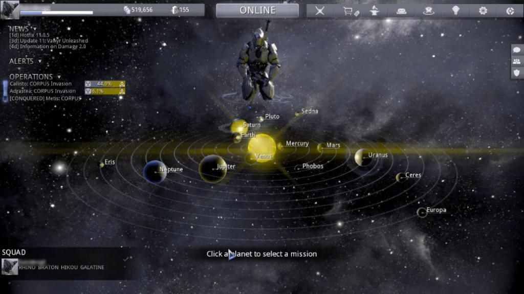
Taken from the login screen of the previous version
-
This is a great idea and something that has come up a few times in the feedback discussions (particular amongst the UI arguements taking place). A test server is the usual way of testing new features, whether it's to a closed or open group of testers. Unfortunately extra builds require extra servers and that costs money, so in the end we would be paying for it in the form of possibly increased costs for platinum or more platinum only purchaces in game.
However people are going to argue that we ARE the test group, being that the game still says beta on the tin. I tend to disagree as beta should have been removed when we had the ability to start paying real money for things. The big (highly flammable) question that always lingers with me is who are we beta testing for?
-
Really great work, this would definitely be a step in the right direction. After all the massive discussions taking place, I'm glad someone came along with the skills to make a decent mock up :)
Edit - the planets are still just grey orbs, but at least they're identifiable grey orbs!
-
I've said everything I really can on the matter at this point but just want to tack on a few extras in reponse to Pablo.
I totally agree with that, it's hard to find a specific planet if you are looking for it, argument against labels was that it was too crowded, newer players are introduced slowly to planets so the need for labels was less. In any case, I agree with you, but I lost that argument internally.
The basic theme of what we have all been saying is that time is precious, and some of us don't have copious amounts of it daily to fiddle with cosmetics. Not every player is going to fall into this category, some people will adapt and be able to blaze through whatever new system is put infront of them and just live with it. But those us of who take a little time to work their way through things, and will never get any quicker at it, may not have the time now required to do so. I for one will soon only have an hour or so daily to play, and I would like to know that should I be able to come back to this game, I'm not going to be spending a majority of my time navigating menus. Anyone working is likely to find themselves in similar situations. Granted the average working adult is probably not what the target market is for this game, but they would make up a very substantial portion of it, and would likely be the largest puchaser of platinum (and I could get right into economics v's demographics here but that's a whole different conversation). Time is a very precious resource and one that should always be given the highest priority when designing something like this.
I'm all for immersion, but it should be done in game, this system is just awkward. We log in to play a game, not to play a menu system.
It's great to see that at least one person in the design team could see at least part of the flaws in this system. It's a shame that others couldn't see past scenery porn.
Again, thanks for taking the time to write this up, it's great to see you guys care enough to spend the time thinking about this.
Don't get any of us wrong, the people here love this game, we wouldn't be up in arms about menus otherwise. So when something changes for the worse, people will get in an uproar and speak their mind (most of the time). We've all dedicated countless hours and even money towards this, and don't wish to see our efforts simply destroyed because of poor decisions.
-
infinite vertical wallruns should never have happened that easily, what "should" have occured was wallrunning up requiring jumping/back flipping to another wall behind you to be able to get higher and even then, only working 2-3x at most.
You're absolutely right, it should never have been in the game to start with. However this is one of those good/bad bugs that has been around for long it's become a feature and a staple part of playing style for most people. Coptering should be gone too, but suppose that won't happen for another 8-9 months, only fair to leave it there the same amount of time as the last "exploit".
this means that the GOOD (high ogris/penta snipe spots) spots will be unreachable in defence missions
People will actually need to play the game legitimately instead of just exploiting it now. [sarcasm] How terrible. [/sarcasm]
This is a moot point as these areas can still be accessed, the only difference now is that you are forced to use a certain frame to achieve certain things. Basically it's penalising people who choose not to use or do not have a specific frame. If they truly want to level the play style so to speak and stop people using such seamingly purpose built features of a map, why not go to straight to the source and make it impossible to get up there in the first place. Trying to go too high on some Jupiter maps for example respawns you on the ground, why not do the same thing here. Bottom line is if you're going to remove an issue, remove the actual issue, not the ability to replicate that issue.
-
I know I've been hammering this point since the update, but since images seem to get the point across better than words, I will borrow a couple of screenshots people have posted for a quick example. Using some CS5 magic and a lot of patience from my partner, someone please explain to me how this;
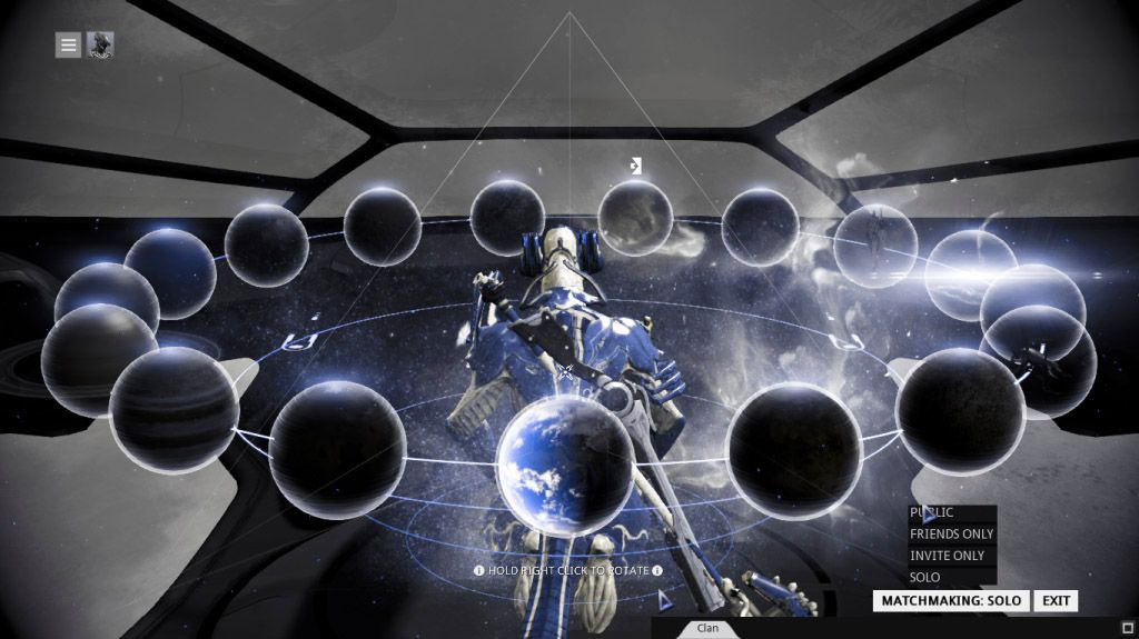
What are all these gray orbs? If this spins around, I have to play hunt the planet every time.
Is better than this;
At least here, I have a central reference point as well as unique sizes and labels to direct my attention.
Before you ask, this is how I see the game and life in general (well as close as I can get). A few people have mentioned to me that similar issues with colour-blindness have been bought up previously and nothing was changed, so sadly I'm not holding much hope at this point.
-
Well it would be nice to see suggestions on how they could improve the UI so everyone is happy.
Such as .. a toggle option? Everyone is begging for the old UI, but i don't see how it would fall in line with our ships.
This is where patience is needed, and actual suggestions on what they could do would help.
Devstreams are good to see what is expected for the future.
Read through here for a lot of very good solutions, but in regards to the above, simply making the planets different sizes and shapes will be the quickest partial solution to this particular issue.
-
-
then what would have made this update not mediocre? NO bugs? I'll tell you right now, even with them staying up to 5:45 in the morning, there was no way they could have eliminated all the bugs. I'm honestly curious as to what would have made this better for you.
The dev team didn't cobble this update together overnight, there was months of planning and design work that had to taken place. They don't HAVE to listen to the people screaming for an update because it's now 2 minutes overdue, they could quite easily tell everyone to just wait another week. I can understand people being frustrated with those who are complaining that bugs exist in a new product. If you review some of the actual well constructed arguements, you will see that a lot of people aren't raving about bugs but about serious design flaws, flaws that could have been rectified with quality control and a proper testing environment. Just because the game is beta does not mean paying customers should be your forced into becoming game testers, especially when something breaks for them that is not reconcilable.
-
Doesn't matter it's here to stay for the moment until a majority of the community complains about it, deal with it.
Perhaps check the UI feedback section of the forums. Plenty of the community there complaining about it, and not all of them can simply "deal with it".
Form over function aside, there is now a another problem where the product (being Warframe) is making people physically ill. Aside from people losing interest in attempting to continue playing, and therefore a potential loss of revenue, there is the potential for legal action should something unfortunate occur. While it's a minority situation, and one I believe can be easily avoided by all involved, this does happen and several companies have been dragged through law suits over similar things. When something you create starts to affect peoples well-being, you need to re-examine what you have changed and find alternatives.
Someone in a different thread put forward the question to the OP, what makes them entitled to have such a strong opinion against what the developers choose to create. The fact some of us have payed money for the development of something that is now unplayable in it's current form is what makes us entitled to such an opinion. That is not money well spent.
-
This change needs to happen FAST though, or those of us who can't stand the inefficiency of the new UI may well find something else to do with their time.
Way ahead of you, unless something is done I'm moving on for reasons I've already stated in several posts. It's very sad to see this is the direction the developers have chosen to take the game in, and I'm desperately hoping this isn't an indication of things to come but just a massive oversight and ambition run rampant. I'm really hoping that someone at DE has noticed what we have all been saying and is making at least an effort to have functionality restored. The quickest way to alienate your end userbase is to mess with basic interaction, the simple act of moving a button for example can have a completely undesired outcome.
-
Wow didn't even think of that one, it's bad enough for us with color vision, most of the planets look pretty similar, earth, jupiter, void and dojo are the only ones I can pick out with ease, sure over time I might learn the rest but it shouldn't be necessary, text labels were invented to avoid issues like these, if each planet had it's name next to it at all times not just when hovered/selected there would be no need to cycle through them or guess.
That halo around each item that makes it so much harder too, especially at lower resolutions. Non planet items like the dojo look like planets until you get your head up close and personal with your screen.
-
I've made a number of posts about this new interface tonight, and it's good to know that when I first logged into U14 and saw this new horror that I wasn't the only one to quickly be mortified at the decision to creation something like this. I've agreed with almost every constructive criticism against this design. Having to tilt and pan a virtual head to see menus was bad enough, the absolute biggest killer for me has been the Planet Selection screen as shown in the OP. This is an absolute game stopper for anyone with Deuteranopia (common, which I have) or Protanopia (rare, I know people who have this) colour blindness. All we can in this screen is a bunch of grey spheres, all the same size, same shape, nothing to distinguish one from another. To me, this is equivilent to the dev team saying "we'll just deliberately restrict a portion of our potential income" as most people in my situation will look at this and think well aint nobody got time fo dat. This was so easily solved in the previous version by having planets different sizes and as the OP mentioned at differing positions from a centre point allowing for quick and easy identification.
Certainly this doesn't remove the rest of the issues, but this one will see me walking away from what is one of my favourite games, in sadness I will add, as all these design issues could be easily solved by giving your end user a choice.

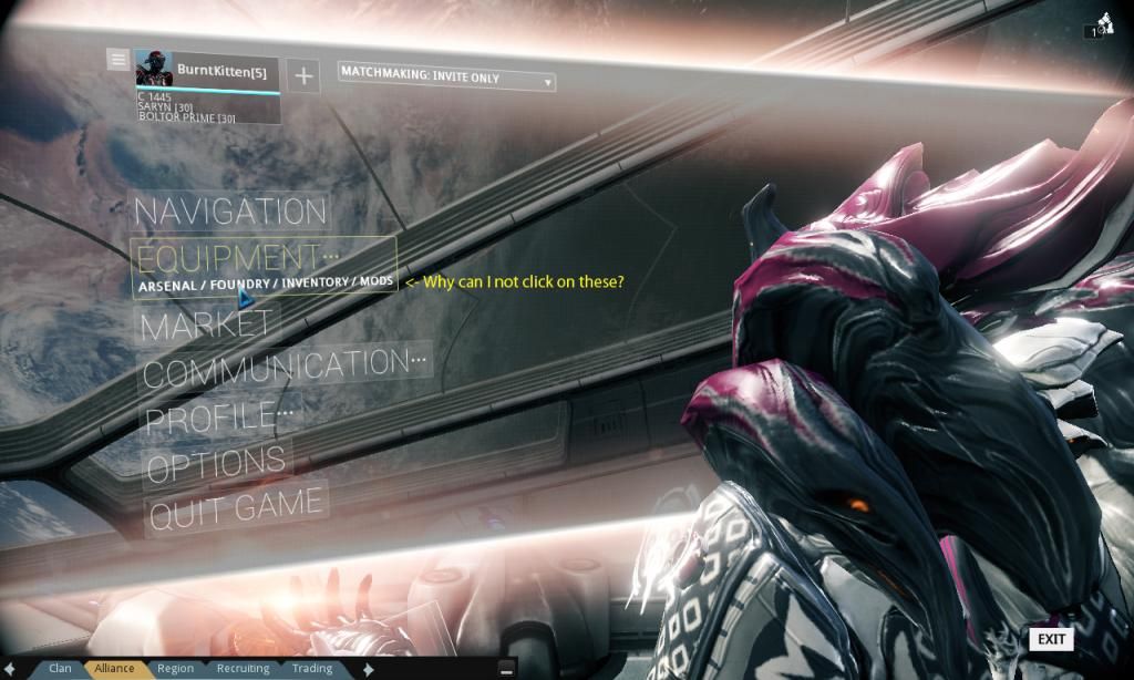
U14 Ui Feedback
in Art, Animation, & UI
Posted
I was in the same boat until today when a few people told me of the latest update. While I love developers that actively add new content and keep a game interesting for the masses, it baffles me when they do so at the cost of so much usability. So ends my hope that Warframe will be actually be a game and not UI fighting match. Uninstalled with sadness.